A UI challenge to design a work management tracker from scratch — focused on clarity over complexity.
This is a UI Challenge — not a business case
StarTrack is a fictional brand created for a personal skill challenge. There is no company, no client, no product launch. This was a deliberate training exercise to practise desktop UI craft, explore information-dense productivity design, and push the quality of my output — built entirely for learning and portfolio purposes.

StarTrack
Work management, made visible
A fictional work management brand designed as part of a UI challenge. The brief: design a desktop tracker that gives teams complete visibility into their work — tasks, progress, deadlines, and priorities — all in a single clean interface.
What is a UI Challenge?
A self-imposed design exercise with a fictional brief, real constraints, and no client. The goal is to practise skills deliberately — exploring patterns, testing ideas, and producing polished output in a low-stakes environment where the only measure of success is craft.
Skills practised
- Desktop UI layout & information hierarchy
- Grid system design & spacing
- Productivity app UX patterns
- Component-level UI design
- Visual brand building from scratch
Challenge
01
Full hi-fi interface
Complete desktop work tracker interface with sidebar nav, task lists, and progress views
Approach
Grid
System-first design
Built around a strict grid system to ensure visual consistency and scalability across all views
Process
Sketch
Hand-first ideation
Started with hand sketches to explore layout, hierarchy, and core interaction patterns before going digital
"Designing for desktop is fundamentally different from mobile — you have more space, but more decisions to make. Every column, every sidebar, every panel has to earn its place in the layout."
Work management tools are powerful and overwhelming. StarTrack picks a different direction — clear, direct, and fast.
The work management software space is dominated by powerful but overwhelming tools — Jira, Asana, Notion, Monday.com. Most of them can do everything, which means most teams only use a fraction of their features and spend time navigating complexity they don't need. StarTrack was designed from the opposite direction: what's the minimum a team actually needs to stay aligned, and how do you make that feel effortless?
The concept started with a hand sketch — working through the core views (task list, project overview, team progress) before a single pixel was placed digitally. Sketching forces constraints. You can't polish a sketch into looking like a finished design, so you're forced to solve the structural problems first: what goes where, what's navigation versus content, how hierarchy gets communicated through space rather than colour.
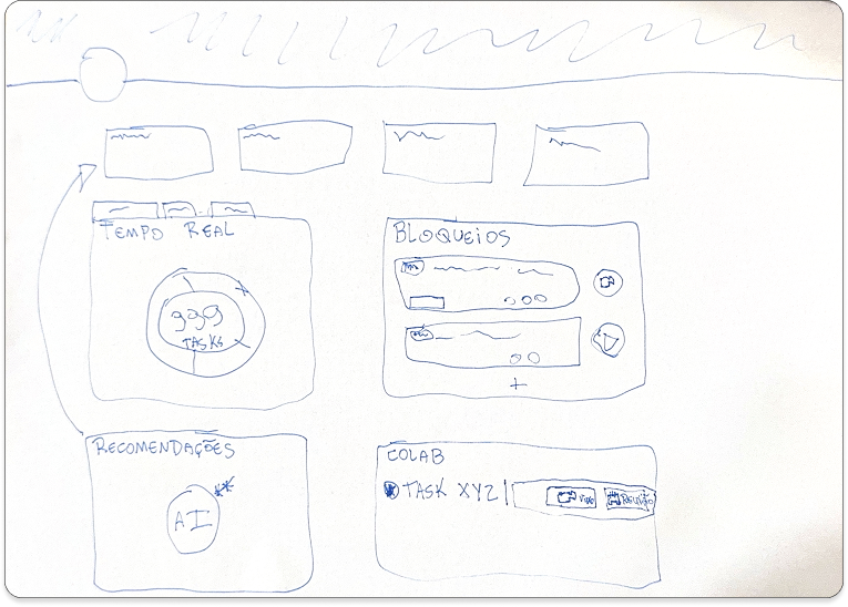
"Sketching before Figma is a discipline, not a workflow. It forces you to commit to structure before you can hide behind aesthetics. The ideas that survive the sketch are the ones worth building."
Grid-first layout
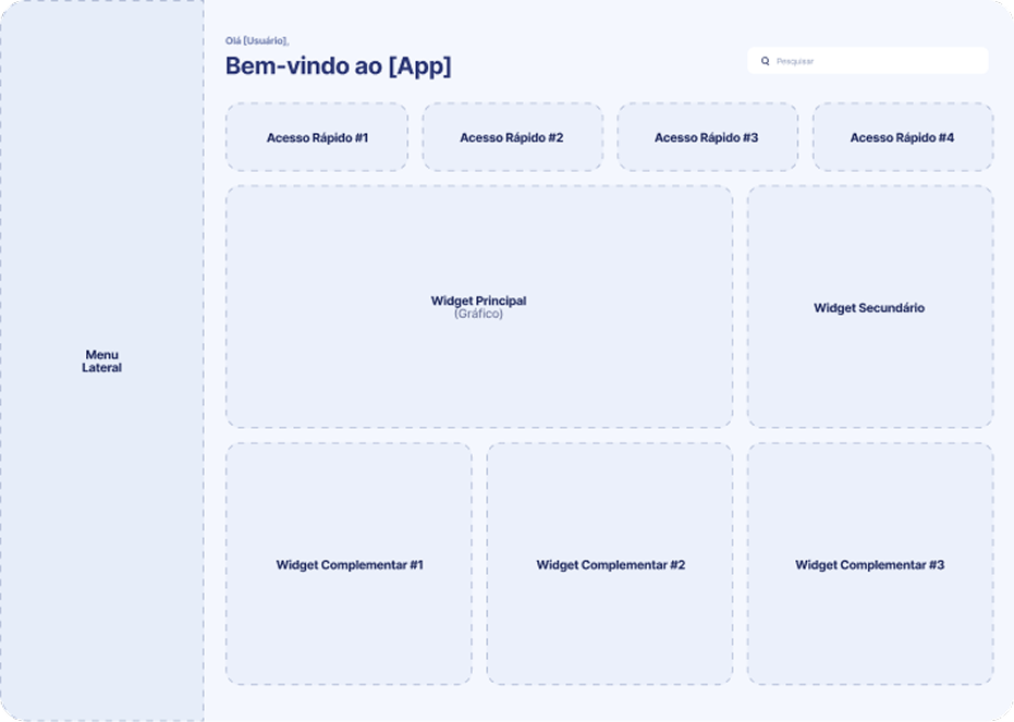
Every element in the interface is built on a strict grid system. This guarantees visual rhythm, makes the layout scalable to different screen sizes, and creates an immediate sense of order that reduces cognitive load.
Progress at a glance
The interface is designed so a team member can understand the current state of work in under 10 seconds — who owns what, what's blocked, what's overdue. No clicking through nested menus.
Status-driven UI
Tasks are grouped and colour-coded by status. Rather than using colour decoratively, it carries semantic meaning — every shade in the palette communicates state, urgency, or ownership.
Team-first perspective
Individual tasks always show their owner. The interface is designed for teams, not solo users — every view surfaces team context, ownership, and workload distribution naturally.
Grid system — Foundation of the layout
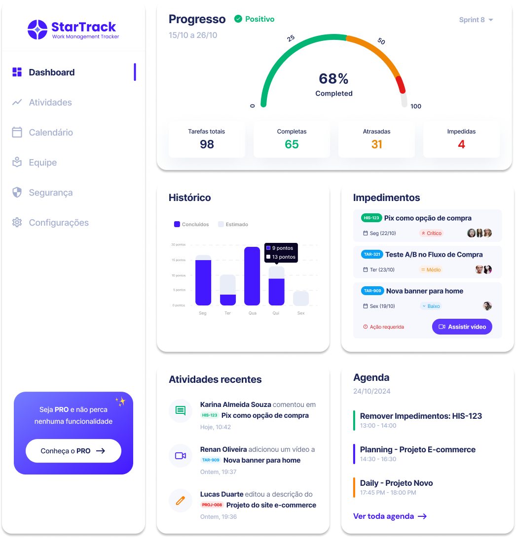
UI Elements — Component library
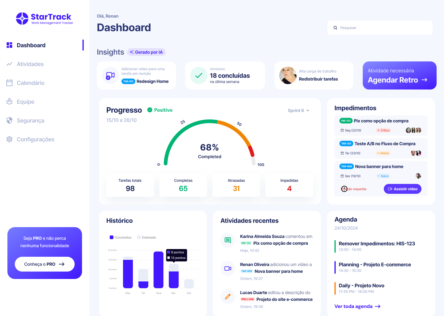
A desktop interface that makes the state of work visible — without making it overwhelming.
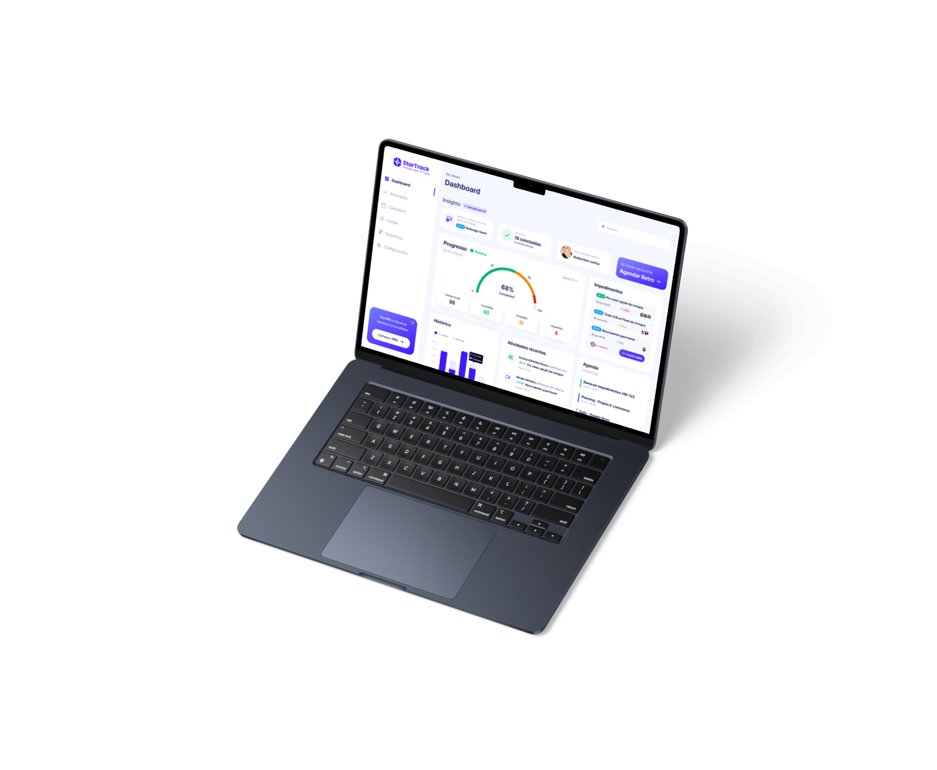
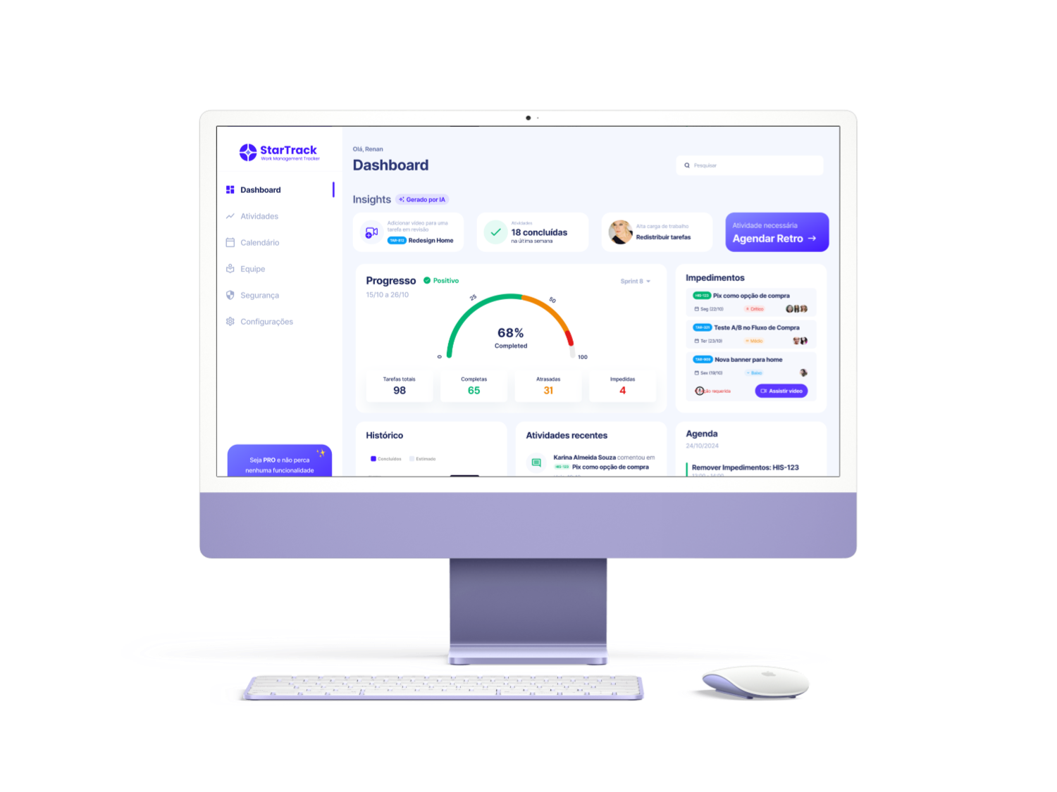
The final interface brings together a structured left-side navigation, a task overview panel, and contextual detail areas — each zone having a distinct function and visual weight. The dark purple palette creates an interface that feels premium and focused, reducing eye strain during long work sessions while keeping the accent colour available for meaningful status and priority signals.
Typography is used to establish clear hierarchy: project names in large weight, task titles in medium, metadata in small regular. Every row, card, and panel is sized and spaced according to the grid system documented in the design phase — nothing is arbitrary. The result is an interface that feels calm even when it's showing a full team's workload.
Final UI — tap to zoom
Device mockups
Key design decisions
Dark theme with accent restraint
The interface uses a deep purple-dark base to create focus. The violet accent is used only for interactive states, status signals, and primary actions — never decoratively. This preserves its communicative power.
Fixed three-panel structure
Navigation sidebar — task list — detail panel. Three zones, each with a single responsibility. The structure mirrors how team members actually think about work — where am I, what's on my list, what's the detail of this task?
Scalable component system
Every UI element — tags, badges, progress bars, avatars — was designed as a reusable component. The interface doesn't contain one-off elements. Everything follows a consistent visual language that scales to new features.
Typography as hierarchy
Font weight and size do the heavy lifting. Large + bold for project names, medium for task titles, small + regular for metadata. Colour is used sparingly so that when it appears, it means something.
Desktop design is about restraint — resisting the temptation to fill space just because it's there.
The most counterintuitive lesson from this challenge: having more screen space doesn't make design easier. It makes it harder. When you're designing mobile, the constraints are brutal and obvious — you simply can't fit everything, so every decision is forced. On desktop, you can fit almost anything, which means every decision has to be deliberate. Adding a column is easy. Justifying why that column needs to exist requires actual thinking.
The hand-sketch phase was critical here. Before touching Figma, I spent time drawing layouts at low fidelity — testing three-panel versus two-panel structures, deciding where navigation lives, figuring out the core hierarchy of the task list view. By the time I opened a design tool, the structural decisions were already made. The digital phase was execution, not exploration.
Working with a strict grid system throughout the project also changed how I think about spacing. Arbitrary margins feel sloppy to me now. Every distance has to be a multiple of the base unit. This isn't perfectionism — it's what makes an interface feel professionally crafted versus assembled. The grid is invisible to users, but they feel it in how the product reads.
"Good desktop UI is mostly about knowing what to remove. The question is never 'what can I fit?' — it's 'what does the user actually need to see, and what can live one click deeper?'"
Key learnings from this challenge
Sketch first, design second
Hand sketching before opening a design tool forces structural thinking. The best ideas come from constraints, not from unlimited options.
Grid = invisible craft
Users don't see grids, but they feel them. A consistent spacing system is the difference between an interface that feels professional and one that feels assembled.
Space is a decision
On desktop, empty space has to be intentional. White space groups, separates, and communicates hierarchy — it's not a failure to fill the screen.