 NerdWallet · 2025–2026 · Full case article
Modernising how people match with a financial advisor.
A re-modernisation of the Advisors Match flow, end to end: from the first question to a booked consultation. Rebuilt mobile-first on a design system I built from scratch, and validated with A/B tests and real users at every step.
- RolePrincipal Product Designer
- TeamSole designer in the business unit
- Worked withProduct, engineering, marketing, compliance
- Year2025–2026
Helping people find the right financial advisor.
NerdWallet Advisors Match connects people seeking financial guidance with advisors who may fit their needs, from a first expression of intent to a scheduled consultation.
NerdWallet already brought substantial traffic through SEO content and campaigns, and it sells leads. So the design focus was clear: convert that intent into qualified leads that reach the results page, while keeping trust in a high-consideration journey.
I was the Principal Product Designer and the only designer in the business unit, working with product, engineering, marketing and compliance.
Entry
SEO articles, the homepage or paid campaigns
Qualification
Profile, financial and goal questions
Personal info & verification
Contact details, phone code, consent
Matching
Advisors that may fit the user’s needs
Results & comparison
Firms side by side, with reasons
Advisor details
Approach, clients, minimums
Scheduling
Pick a time, confirm the free call
The funnel lost most of its volume before anyone saw a match.
People come to Advisors Match to find an advisor, but the product has to qualify them first: ten steps of profile, financial and personal questions, then phone verification. All before a single match appears.
Volume halves at the ZIP code, drops again at the advisor questions, and keeps falling through every personal-information step.
Every lost user is a person who didn’t get advice, and a lead the business and its advisor partners never received.
Largest single drop: the ZIP code, −47.1 points. Across the personal-information steps, 34.2 becomes 17.0.
Shorter wasn’t automatically better.
Cutting questions would raise completion and lower match quality. Four tensions pulled against each other, and each one shaped a design decision.
Every question costs completion, but advisors need enough context for a useful first call.
Contact details are asked before any match is visible, in a category where people fear sales calls.
TCPA consent and advisor disclosures are legally required before anyone can be contacted.
SEO readers, homepage visitors and paid traffic arrive with different context, 87% of them on mobile.
Three tensions, three design answers you can see on the screen.
The fourth, one flow for many contexts, is answered by the system further down.

Each question says why it’s asked, and answers in one tap.

Blurred matches appear “ready” before we ask for the phone number.

Consent is a short, explicit sheet. The full legal text stays readable in place.
Four principles guided the redesign.
Show value before every ask
Make the outcome (matched advisors, a free call) visible before asking for effort or data.
Every question earns its place
Keep what drives the match; make each answer cheaper to give.
Trust and consent are part of the flow
Explain why we ask; disclosures and consent are readable, native and never a dead end.
Scale through one system
Every journey has to talk to the others and be designed as one. A shared system keeps them consistent as they multiply.
Expectations first, questions second.
The homepage sets expectations before the first question: three steps, free, no obligation. People know what they’ll get, and what it will cost them, before they spend any effort.
Same story on mobile, stacked, where 87% of the traffic lands.


A/B tests and interviews, at the same time.
While the A/B tests ran, I validated the same variants in qualitative interviews. The numbers showed what people did; the conversations showed why.
Running both together made it possible to reach new discoveries, and new learnings, fast.
Grounded in the funnel data
Every change starts where people drop, and says what it should move.
What people do
Variants run on live traffic, judged by leads reaching their matches.
Why they do it
The same variants, with real people talking them through.
Two directions, four open questions.
A mobile-first rebuild and a modernised funnel explored different answers to the same questions. Neither questionnaire was final; each one fed the tests that followed.


Every decision started as a hypothesis.
Each one was grounded in the funnel data, and only became part of the flow after real users confirmed it. Three of them changed the shape of the questionnaire.
Remove effort from the ZIP code.

Show value before the phone ask.

Lead with the user’s goal.

HUE, in practice.
Traffic was already strong, so conversion was the question. To guide decisions while iterating, we built HUE (Happiness, Usability, Engagement), our own adaptation of Google’s HEART framework.
Here are three of the experiments: what we tested, what we observed, and what we chose.
Progress that feels close to done.

Three stages
One bar
An age picker that takes one tap.
Scroll
Text input
Ranges, one tap
Legal texts that build trust, not friction.
Open mid-screen
Behind the shield
Fewer screens didn’t mean less effort.
Grouping name, email and phone on one screen looked like the obvious shortcut. We tested it against one detail per step.
A · One grouped screen
Name, last name and email together.1 · Name
2 · Email
3 · Mobile number
4 · Verification
B · One detail per step
Each with a short reason, and the matches preview before the phone ask.Every decision, in motion.
The shipped flow end to end, built from the real screens. The journey runs in four moments, and every change in it was a hypothesis, tested with real users and measured.
Lead with the goal, answer in a tap.
Goals, finances and life stage. Each question says why it shapes the match, and answers in a tap.
Shipped · Live productTop priority
The goal opens the flowZIP code
Location assist + city checkEarn the most sensitive ask.
The most sensitive ask needed the most convincing: a loading screen that explains the match, blurred matches as a trigger, and readable legal text.
Loading screen
Explains what happens nextMatches as a trigger
Value before the phone askReadable consent
TCPA, explicit and in placeMatches people can compare, and act on.
After verification, the job changes from collecting information to helping someone choose. Each match ties the user’s answers back to the result; firms sit side by side with the same structure; specialities, assets under management and a verified badge show trust before any commitment.
Your matches
Each firm with why it was recommendedCompare
The same structure, one swipe awayFrom a chosen match to a booked call.
The lead is generated when the user reaches their matches. The last moment gives them a clear next step: a free consultation in a few taps. Booking lives inside the match, so the user never leaves the context that convinced them. It later grew into a sub-product of its own.
Advisor detail
Approach, clients, minimumsPick a time
The advisor’s calendar, inlineBooked
Who, when, add to calendarLive product. Screens show the shipped flow at the time of the work; ongoing A/B tests and variations may differ from what is live today.
One system, many journeys.
Three entry points, tailored journeys and five sub-products, with 87% of traffic on mobile. Every journey had to talk to the others, so they had to be designed as one.
I built the design system from scratch, on my own: foundations, components with their states, and compositions reused across mobile and desktop. It was AI-first from documentation to implementation, and I had full autonomy over how components were used and developed.
- FoundationsColour by role, type by job, one layout grid.
- Components with their statesActions, inputs, selection and guidance: enabled, disabled, selected, valid.
- Documentation, AI-firstWritten and kept up to date with AI.
- Implementation, AI-firstFrom the documented component into code.
- Full autonomyOver component use and development.
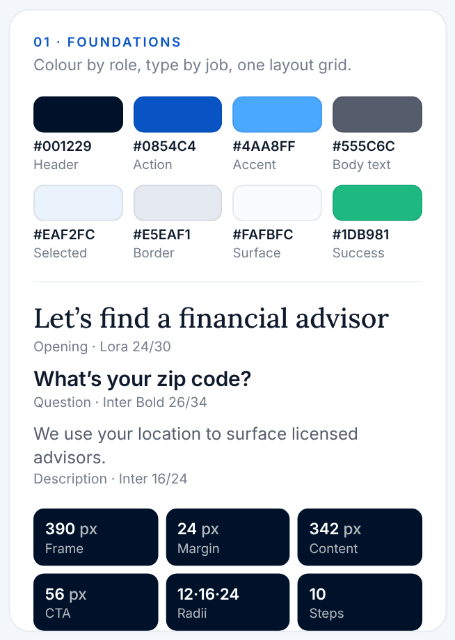
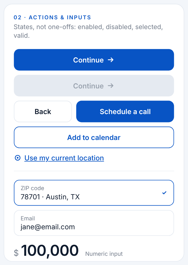
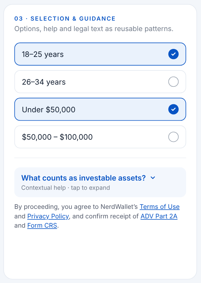
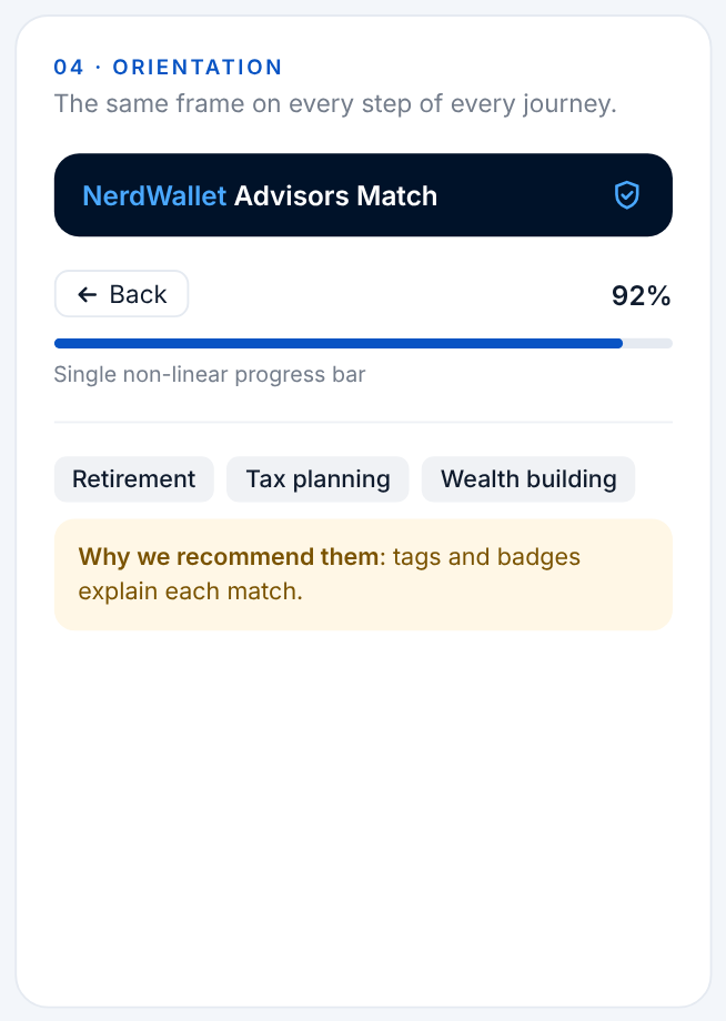
New journeys start from tested components, and a familiar frame on every step reassures people. That is how one flow could serve SEO readers, homepage visitors and paid traffic without becoming three different products.
More qualified leads, without trading away trust.
More leads generated: people who reach their matches after verification. Of every 100 who start, 21.6 now get there, up from 17.0.
More starts past the ZIP code, the biggest leak.
Advisor-rated lead quality vs. baseline.
Cost per lead on paid campaigns: same spend, +27% leads.
Satisfaction on the results page (CSAT, out of 5).
Median time to finish the questionnaire.
Completion among users who opened the disclosures sheet, vs. inline text.
Trust and conversion aren’t a trade-off.
In regulated, lead-based products, good design is an honest exchange: ask only for what you need, explain why, and give something back at every step. Done well, trust compounds into conversion.
The size of the ask beats the number of screens.
Separate, explained steps converted better than one grouped form. People don’t count screens; they weigh what each one asks of them.
Conversion and lead quality are one problem.
Every question removed had to be weighed against the match it supports. Growth that sends advisors worse leads isn’t growth.
Measure the journey, not the step.
A lift at one step can hide a loss further on. We judged every change by leads reaching their matches, not by the step it touched.
Thanks for reading. Next up: Doctoranytime.
From a doctor directory to a broader health ecosystem: a new brand, a complete product experience and a design system with tokens built for the business.