Context
A UI challenge to design a health companion app end-to-end — from registration to dashboard.
This is a UI Challenge — not a business case
Meeseeks Digital is a fictional brand created for a personal skill challenge. There is no company, no client, no product launch. This was a deliberate training exercise to practise UI craft, explore design decisions in a health context, and push the quality of my output — built entirely for learning and portfolio purposes.
Meeseeks Digital
Elevating your active lifestyle
A fictional health-tech brand designed as part of a UI challenge. The brief: design a full-featured mobile activity tracker — personality, onboarding, and dashboard included.
A self-imposed design exercise with a fictional brief, real constraints, and no client. The goal is to practise skills deliberately — exploring patterns, testing ideas, and producing polished output in a low-stakes environment where the only measure of success is craft.
- Competitive benchmark & research
- Lo-fi wireframing at speed
- Progressive disclosure & form UX
- Hi-fi visual design & data viz
- Health domain design patterns
Part 01
17
Lo-fi wireframes
Full registration & onboarding flow — from welcome screen to app setup
Part 02
5
Hi-fi final screens
Dashboard + Heart Rate, Calories, Steps & Sleep detail screens
Framework
HEART
Process framework
Happiness — Engagement — Adoption — Retention — Task success
"The biggest design challenge wasn't the dashboard — it was the registration flow. Getting a user to trust you with personal health data in under 5 minutes requires every screen to earn its right to ask."
UI Challenge
Skill Exploration
Health & Fitness
Mobile — iOS
Wireframing
Hi-Fi Design
HEART Framework
Discovery
Before designing, I studied what the best already do — and where they fall short.
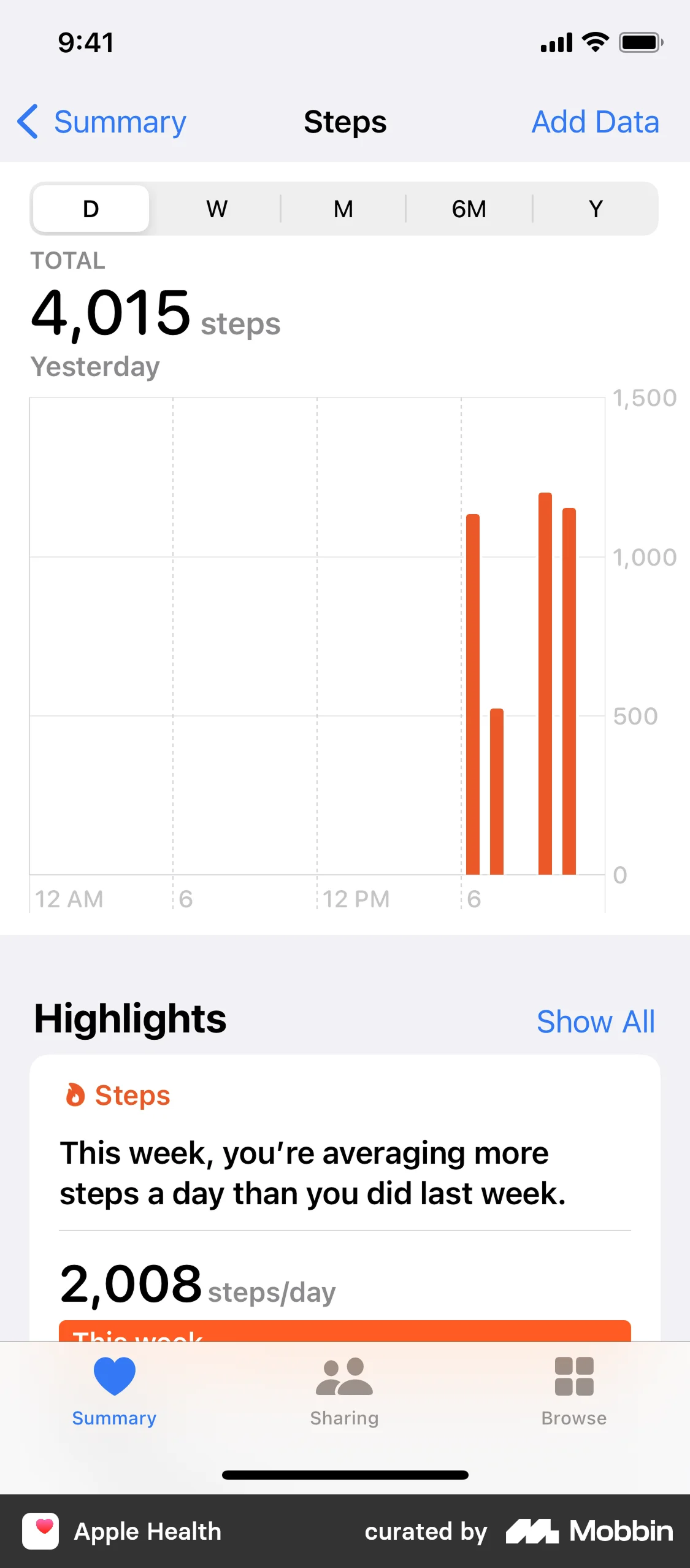
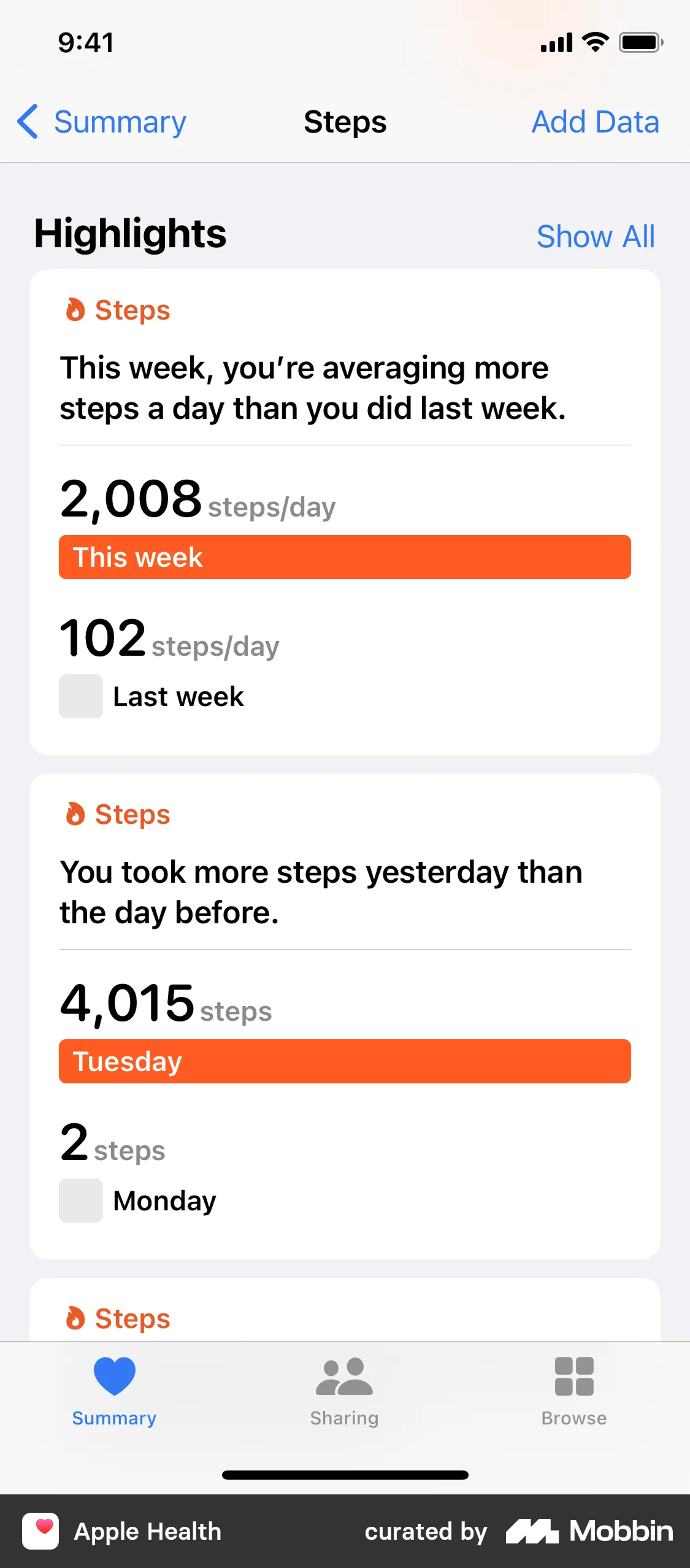
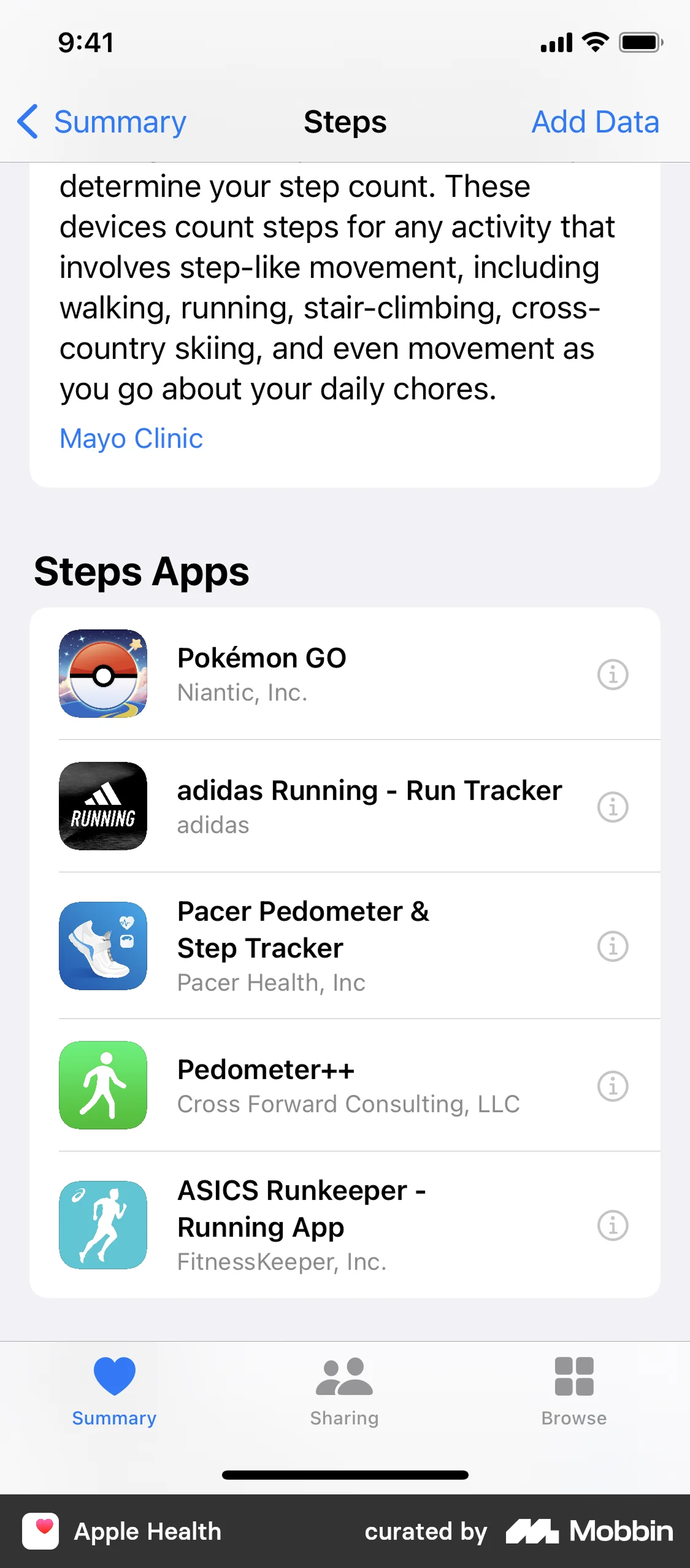
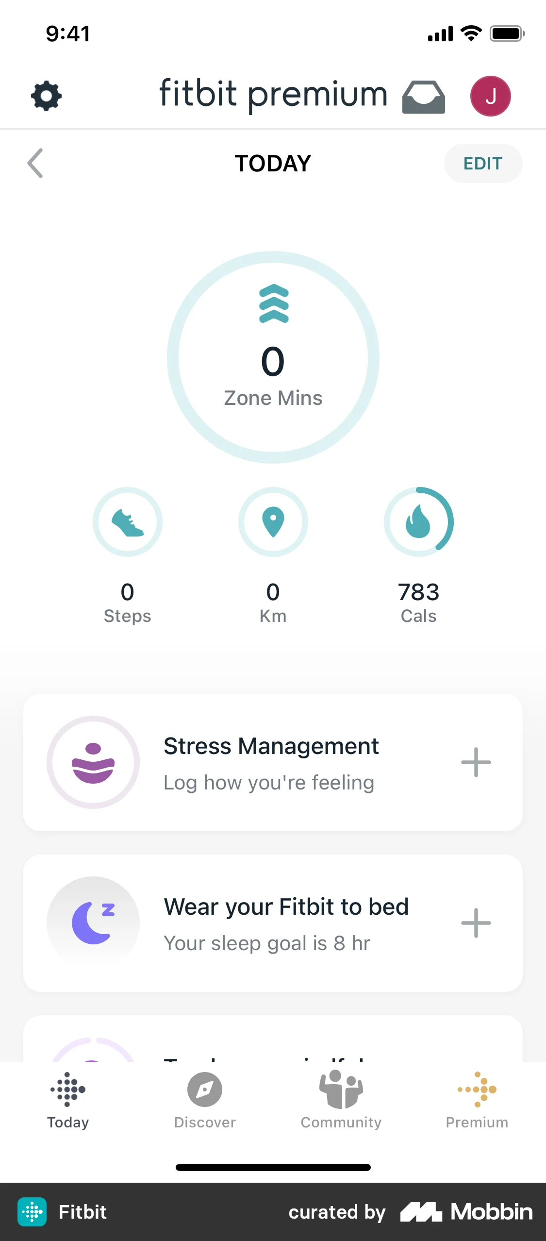
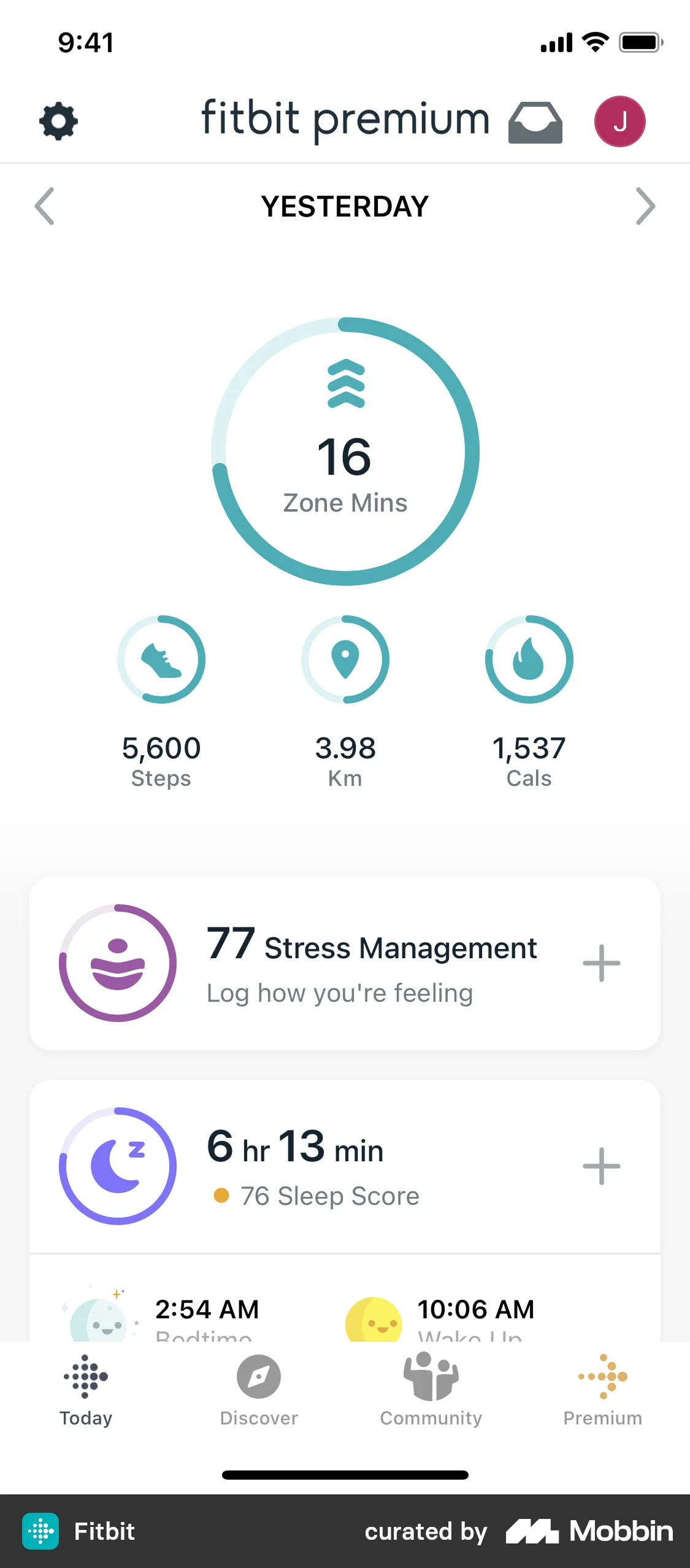
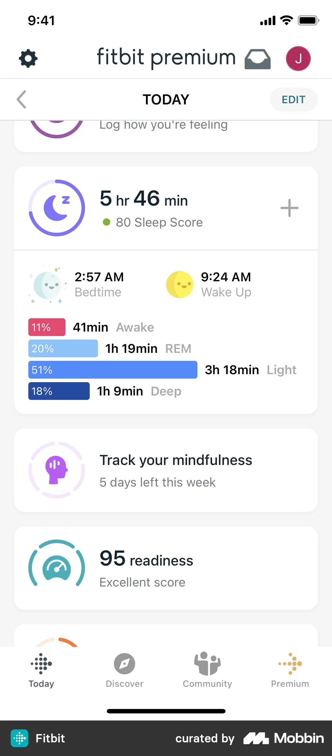
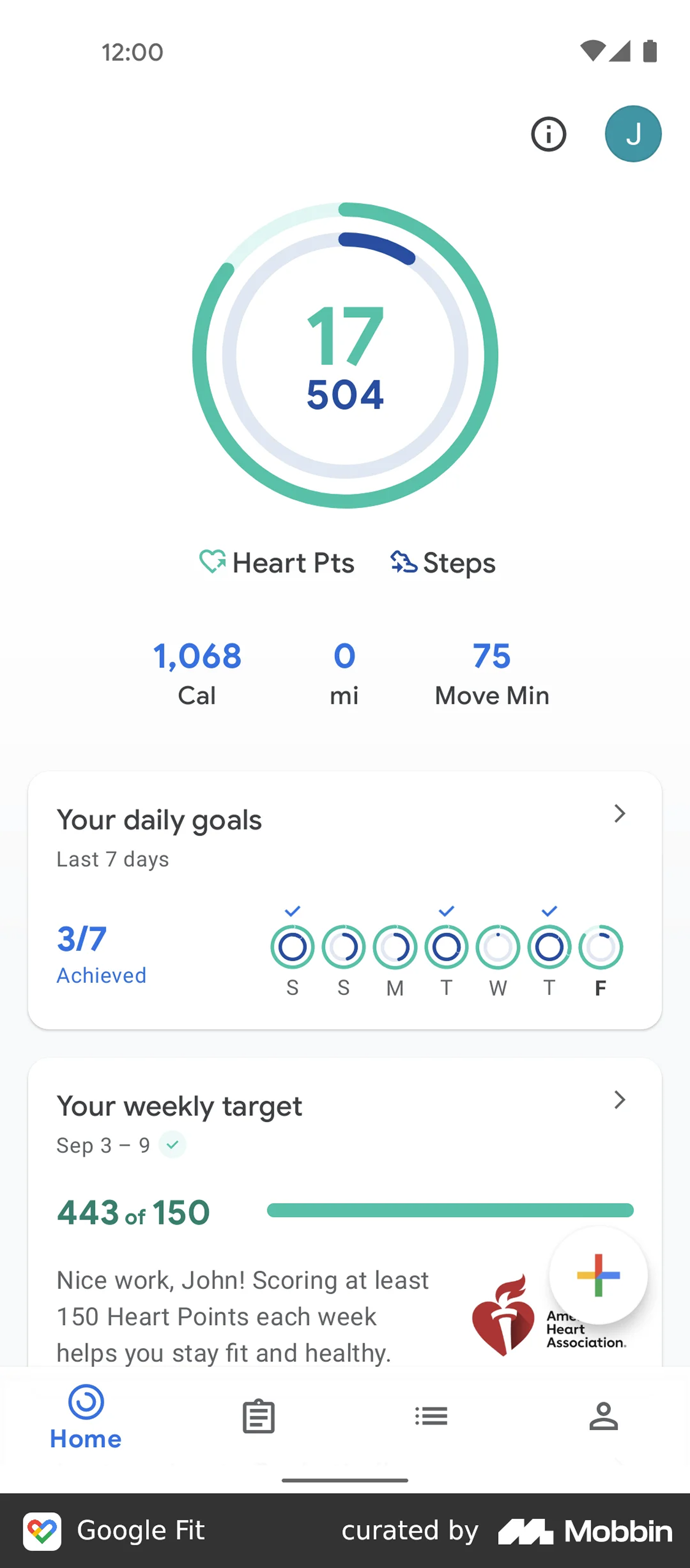
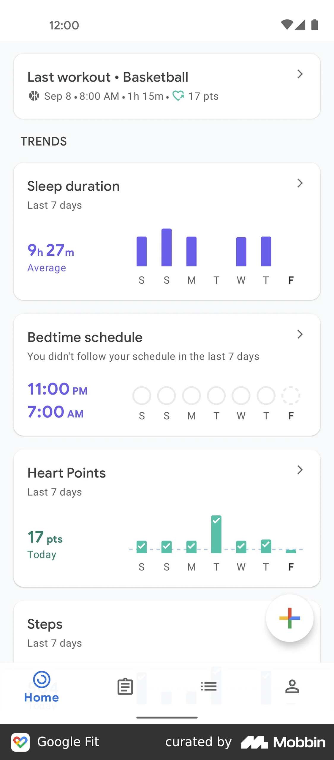
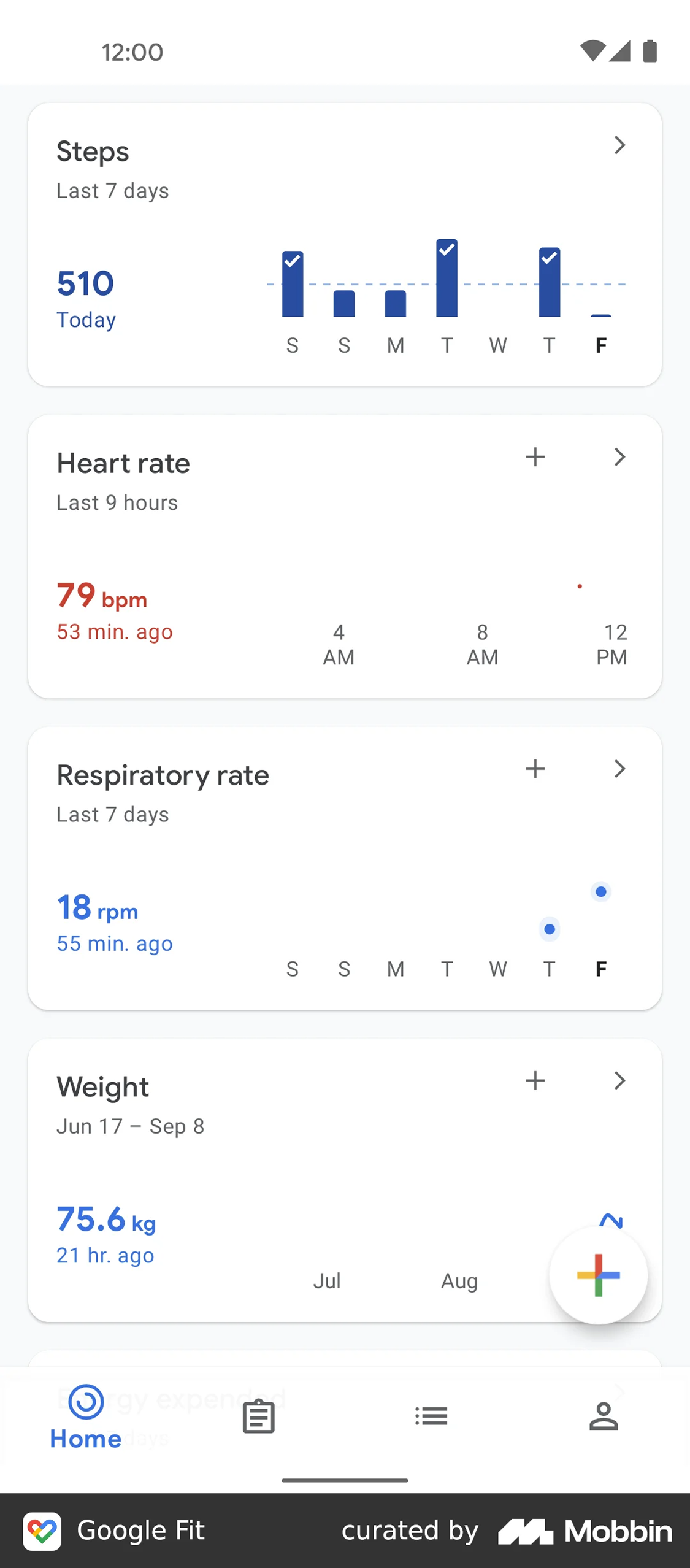
The activity tracker market is saturated. Fitbit, Apple Health, Samsung Health, Google Fit, Garmin Connect, Health Mate — every major tech company has a stake in this space. Rather than designing in a vacuum, I ran a structured benchmark analysis covering both onboarding flows and general UI patterns across six competitors.
The goal was to identify where each app excels, where it frustrates, and what patterns users have already been trained to expect. Designing against established mental models in a health app isn't just a UX nicety — it directly impacts whether someone will actually use the thing every day or abandon it after a week.
"Most trackers front-load too much during registration. Users don't want to answer 20 questions before seeing any value. The best performers ask less and explain why they're asking."
Apple Health — General UI
Competitive Analysis
Onboarding Patterns
UI Patterns
Data Visualisation
6 Apps Analysed
Part 01 — Lo-fi Wireframes
Registration Flow
17 screens. One goal: get users through onboarding without losing them.
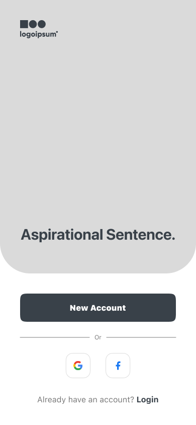
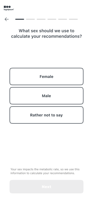
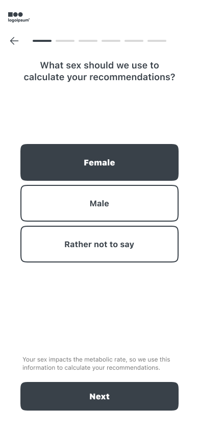
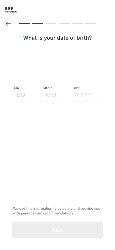
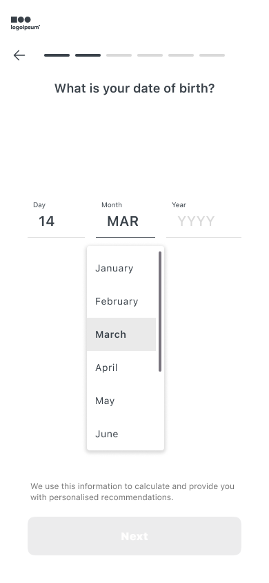
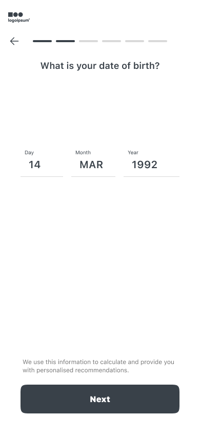
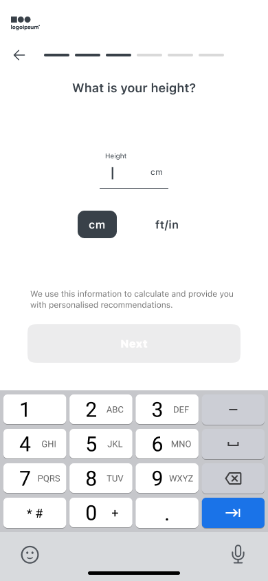
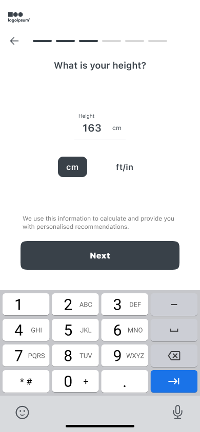
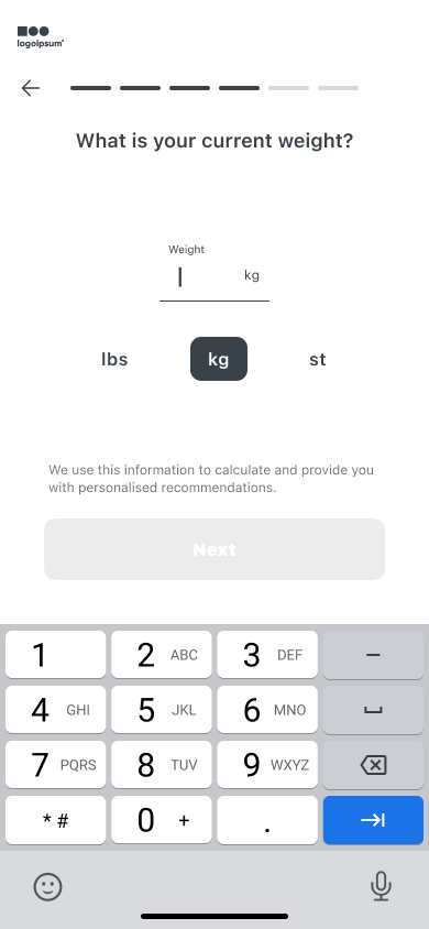
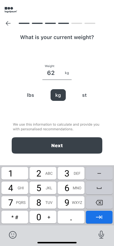
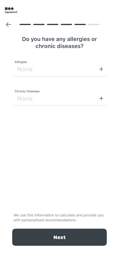
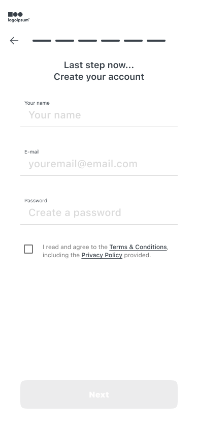
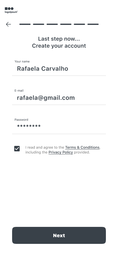
The registration flow was designed as a step-by-step progressive form — each screen asking for exactly one piece of information. A persistent progress bar at the top lets users know where they are in the journey, reducing the anxiety of an uncertain endpoint. Every data input comes with a one-line explanation of why Meeseeks needs it: no surprise questions, no ambiguity.
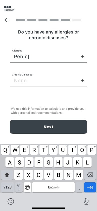
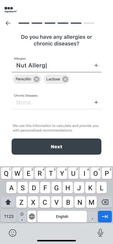
Key design decisions: the sex selection screen includes a "Rather not to say" option — with a transparent note explaining that sex is used only to calculate metabolic rate for recommendations. Height and weight inputs offer immediate unit switching (cm → ft, kg → lbs) so the app never forces a measurement system on the user. The allergies and chronic diseases screens were designed with both free-text and quick-select chips to minimise friction.
Registration flow — All 17 wireframe screens
All 17 registration wireframes — tap any screen to zoom
"Lo-fi on purpose. Working at wireframe fidelity forces you to solve structure and hierarchy without hiding behind colour or beautiful type. Every decision has to be justified by function."
Registration Flow
17 Wireframe Screens
Progressive Disclosure
Gender-Inclusive Design
Unit Switching
Micro-copy
Part 02 — High-Fidelity UI
Final UI
A dashboard that puts everything important in one glance — and lets users dive deeper on demand.
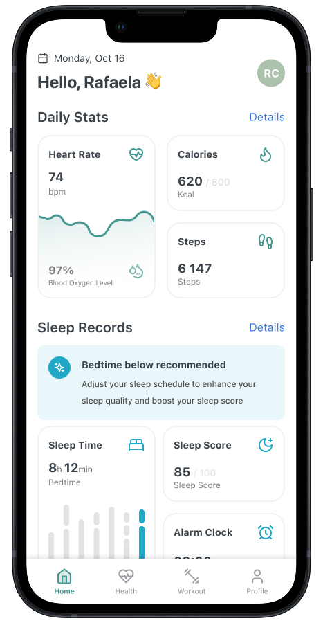
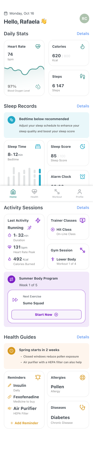
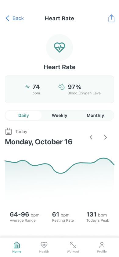
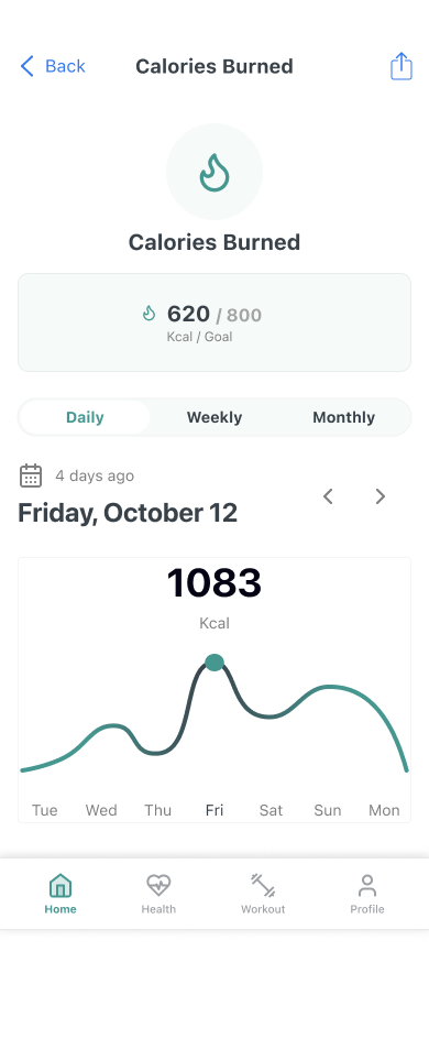
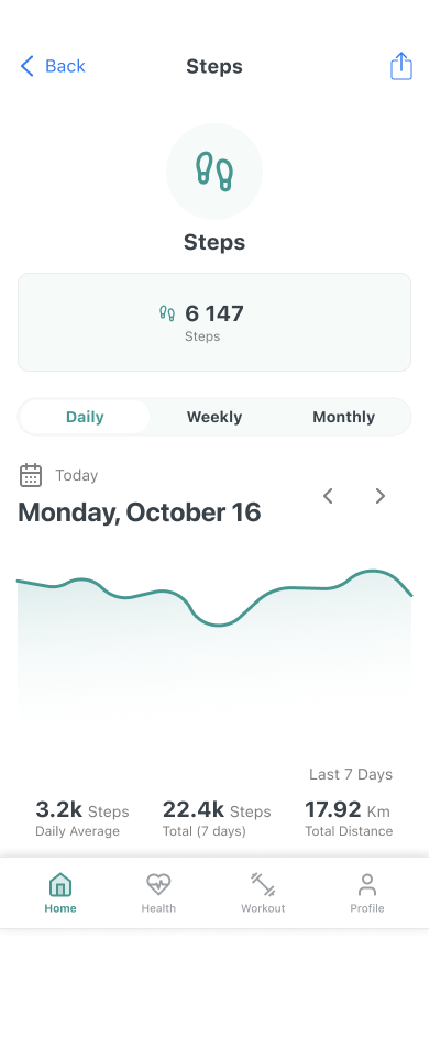
The final UI was designed around a single design principle: progressive disclosure. The home dashboard gives the user their most important metrics at a glance — heart rate, calories burned (vs. goal), steps, and blood oxygen level. From there, every metric is tappable, opening a dedicated detail screen with daily, weekly, and monthly views.
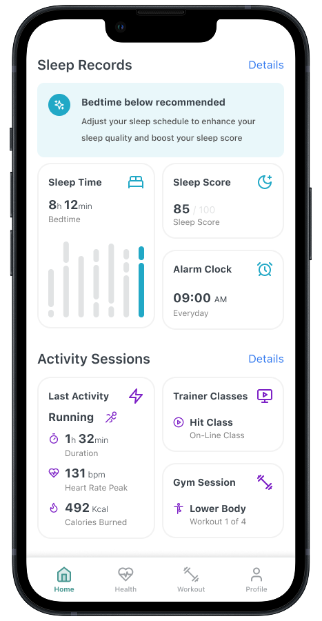
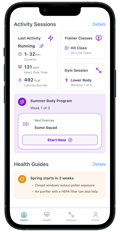
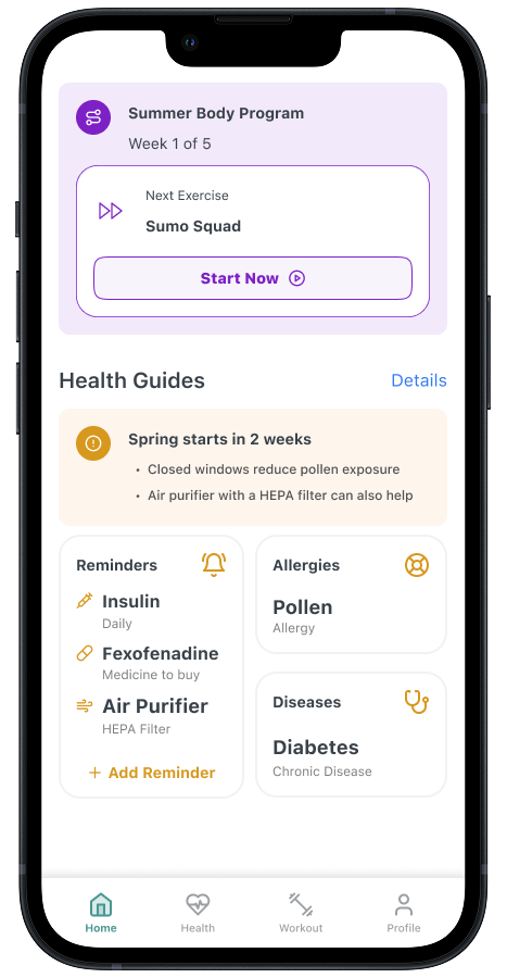
The visual language uses a clean white base with a teal accent that feels calm and clinical without being cold. The bottom navigation bar (Home, Health, Workout, Profile) was kept intentionally minimal — four tabs, no overflow menus. Activity sessions and health guides surface contextual, personalised content below the fold without competing with the core stats.
Final UI — 5 screens — tap to zoom
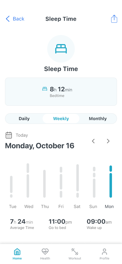
Dashboard — Heart Rate — Calories Burned — Steps — Sleep Time — the complete final UI
Dashboard — Key design decisions
Daily Stats first
Heart Rate, Calories, Steps, and Blood Oxygen are the four core metrics surfaced immediately — no scroll required. Everything else lives below.
Goal-based display
Calories shows 620 / 800 Kcal — progress against goal, not just a raw number. This turns a stat into a motivator.
Sleep advisory
The sleep section surfaces a contextual alert ("Bedtime below recommended") with actionable advice — turning data into guidance.
Daily / Weekly / Monthly
Every detail screen exposes three time-range tabs. This lets power users analyse trends without cluttering the dashboard for casual users.
5 Hi-Fi Screens
Progressive Disclosure
Data Visualisation
Bottom Navigation
Goal Tracking
Health Guides
Reflection
UI challenges are a test of discipline — not just craft.
Working on Meeseeks Digital reinforced something I believe about UI work: constraints are features. The challenge format forced a clear scope — registration flow first, dashboard second — and that structure meant every design decision was made in service of a specific deliverable, not an open-ended brief. It's easy to overengineer when the scope is limitless. It's much harder, and much more instructive, to do excellent work inside a box.
The benchmark research was probably the most valuable part of the process. Six apps, two flows each (onboarding + general) — spending time there before touching Figma changed what I built. I stopped asking "what should this screen look like?" and started asking "what have users already learned to expect here, and how do I respect that while adding something better?"
The split between lo-fi and hi-fi was also intentional and useful. Wireframing the registration flow at low fidelity meant I could test the logic and structure of 17 screens quickly — without any temptation to polish aesthetics at the wrong moment. By the time I moved to the dashboard hi-fi, every structural decision was already resolved. The hi-fi work was almost pure craft from that point on.
"The best insight from this challenge: tracking apps succeed or fail in their first five minutes. If the registration flow loses someone, there is no dashboard to show them."