Supply chains hide
uncomfortable truths.
FairSupply is an environmental accounting and supply chain risk intelligence platform built by a team of mathematicians, legal experts, and environmental scientists. Using just supplier names and spend data, it maps risk across global supply chains up to 10 tiers deep — flagging modern slavery, carbon emissions, biodiversity impact, and trade tariff exposure automatically.
The product had strong market traction and a technically exceptional foundation when I joined. The challenge wasn't building something new — it was making what already existed genuinely accessible. FairSupply had just completed a significant brand refresh with For Good Design Lab, and needed that ambition translated into the product itself.
But the complexity went beyond product design. FairSupply was mid-transformation: moving from ESG consulting firm to B2B SaaS, repositioning its market strategy, and redefining how it thought about building software. I was the first Product Designer to join. The brief extended beyond shipping screens — it meant helping establish a product culture from scratch: structured validation, iterative design cycles, and shared visual language in an organization that was moving fast in a direction it was still defining.
Powerful data.
Overwhelming interface.
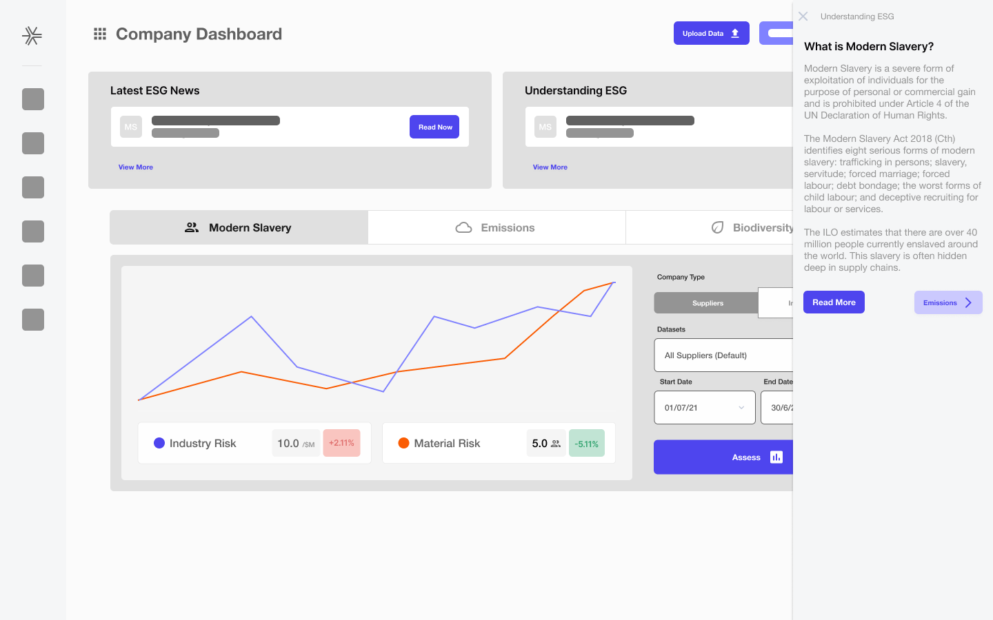
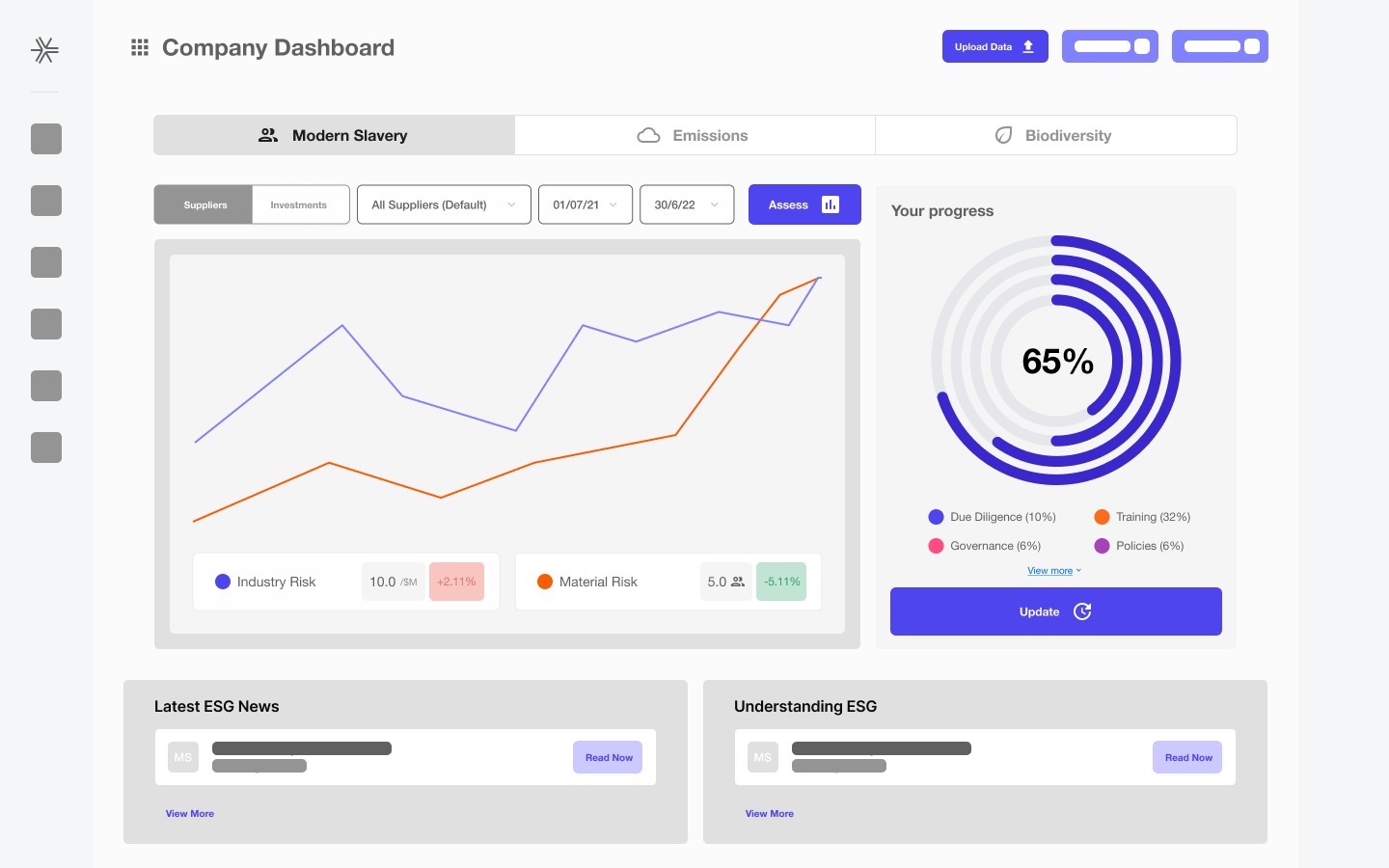
The existing UI had been built around the data model, not around the user. It worked — technically. But using it required an in-depth understanding of ESG frameworks, a tolerance for dense unstructured information, and, as one team member put it, "not only a stiff drink but also an in-depth knowledge of ESG."
The product used purple as a category fill, a card accent, and a button background — simultaneously. Status colors were heavily saturated, making every supplier look critical even when most were fine. Tables felt like spreadsheets. Typography had no hierarchy.
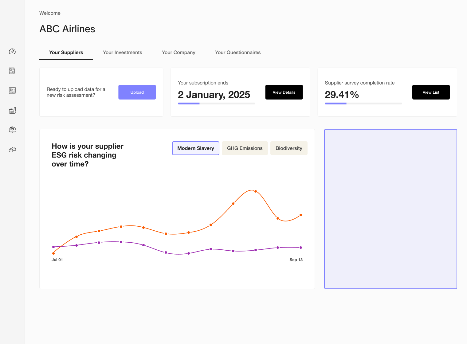
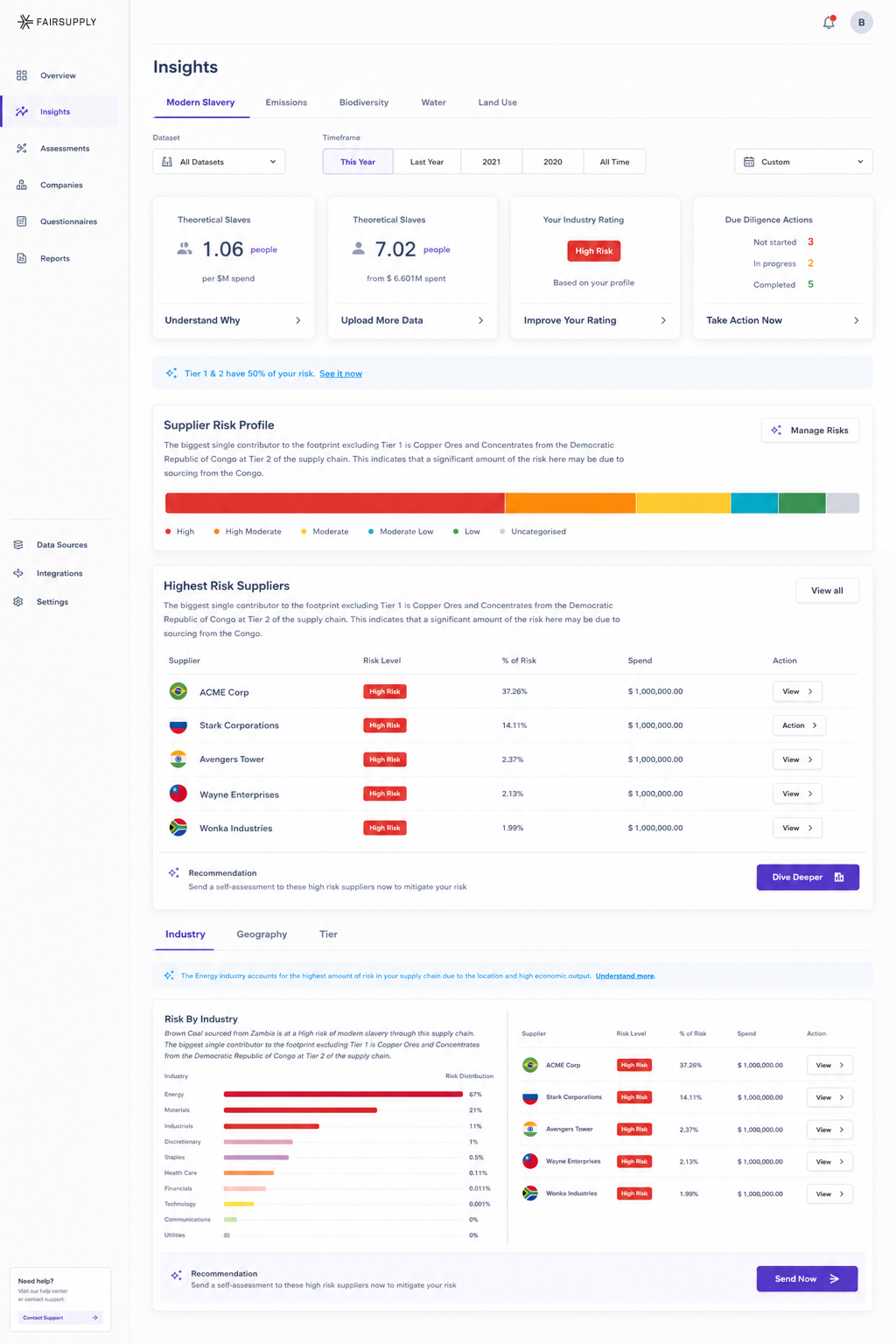
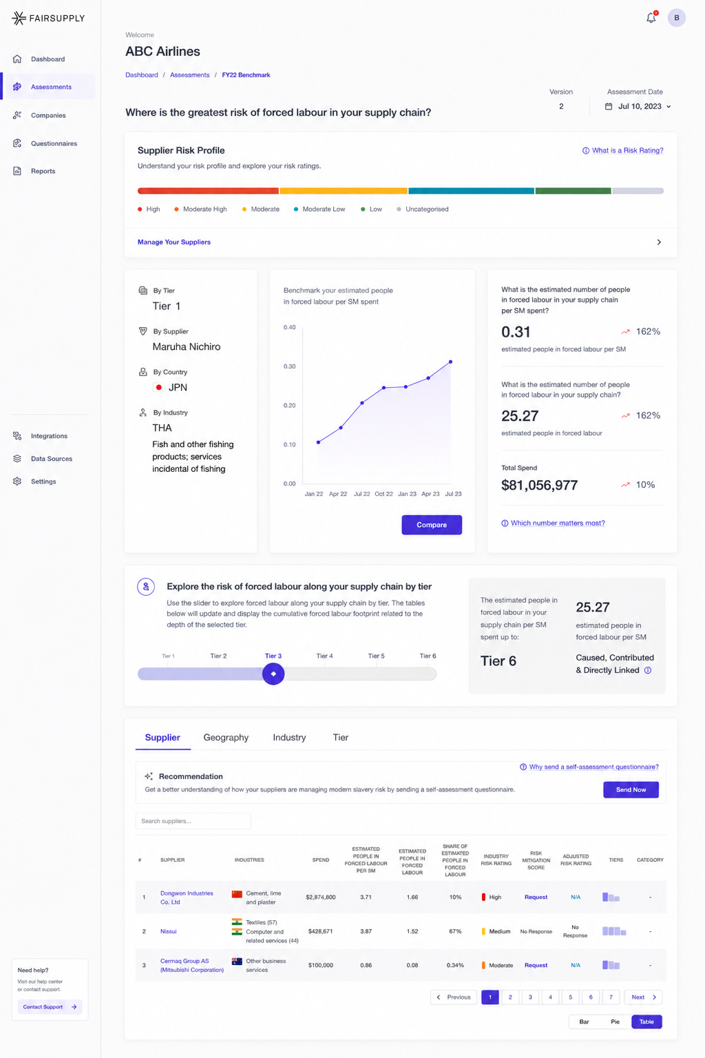
At the same time, stripping it down wasn't the answer. FairSupply's power is entirely in its data. The supply chain maps, the risk distribution bars, the multi-tier supplier tables — these weren't decoration. They were the product.
The real challenge was a fundamental tension: make it accessible without making it shallow. Help newcomers understand their exposure. Give experts the depth they need. Communicate uncomfortable findings without panic. Present uncertainty honestly without eroding confidence.
"The existing UI was incredibly complex — using it required not only a stiff drink but also an in-depth knowledge of ESG. That's a luxury many customers simply don't have."
As the first and only Product Designer, I operated across the full scope — product strategy, IA, UX, UI, research, and design system infrastructure. I worked closely with founders, product managers, engineers, PhDs, and ESG specialists. The role required bridging highly technical domain expertise with accessible product thinking, while simultaneously helping establish a culture of validation and iteration in an organization that hadn't had design leadership before.
The rules we set
before touching a pixel.
Before designing any screen, I worked with leadership and the team to lock in guiding principles. These weren't aesthetic preferences — they were strategic commitments that every downstream decision had to respect.
Structure first,
style never.
Before touching any visual design, I spent time understanding what existed, where the friction was, and what the information architecture actually needed to be. The wireframing phase was essential — it kept visual decisions out of structural conversations, and structural decisions out of visual explorations.
Alongside screen-level wireframing, I explored broader layout structures and navigation patterns — testing how content would distribute across different IA approaches before committing to any direction.
Navigation IS
the product.
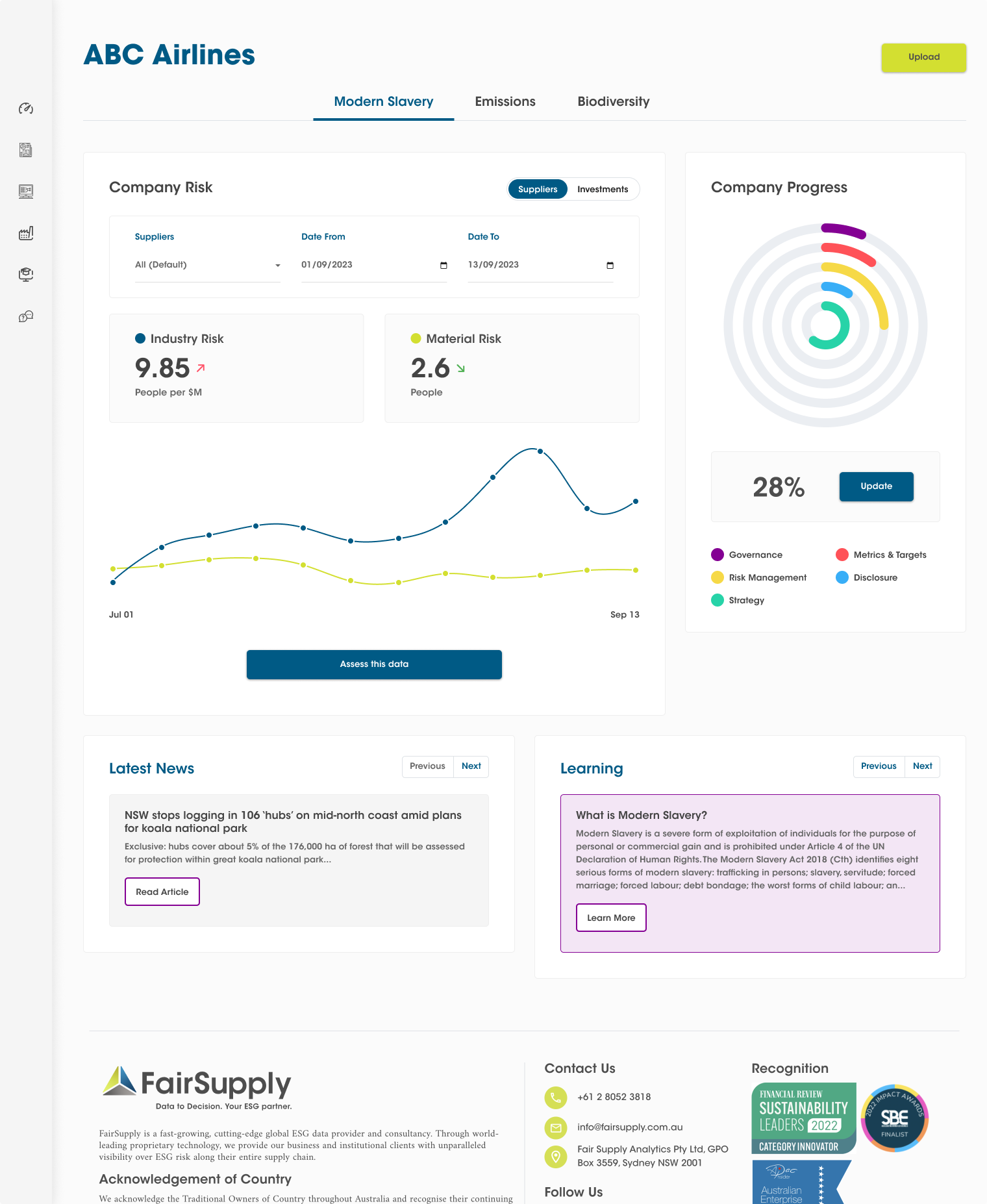
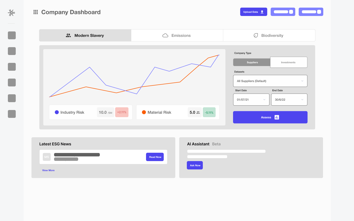
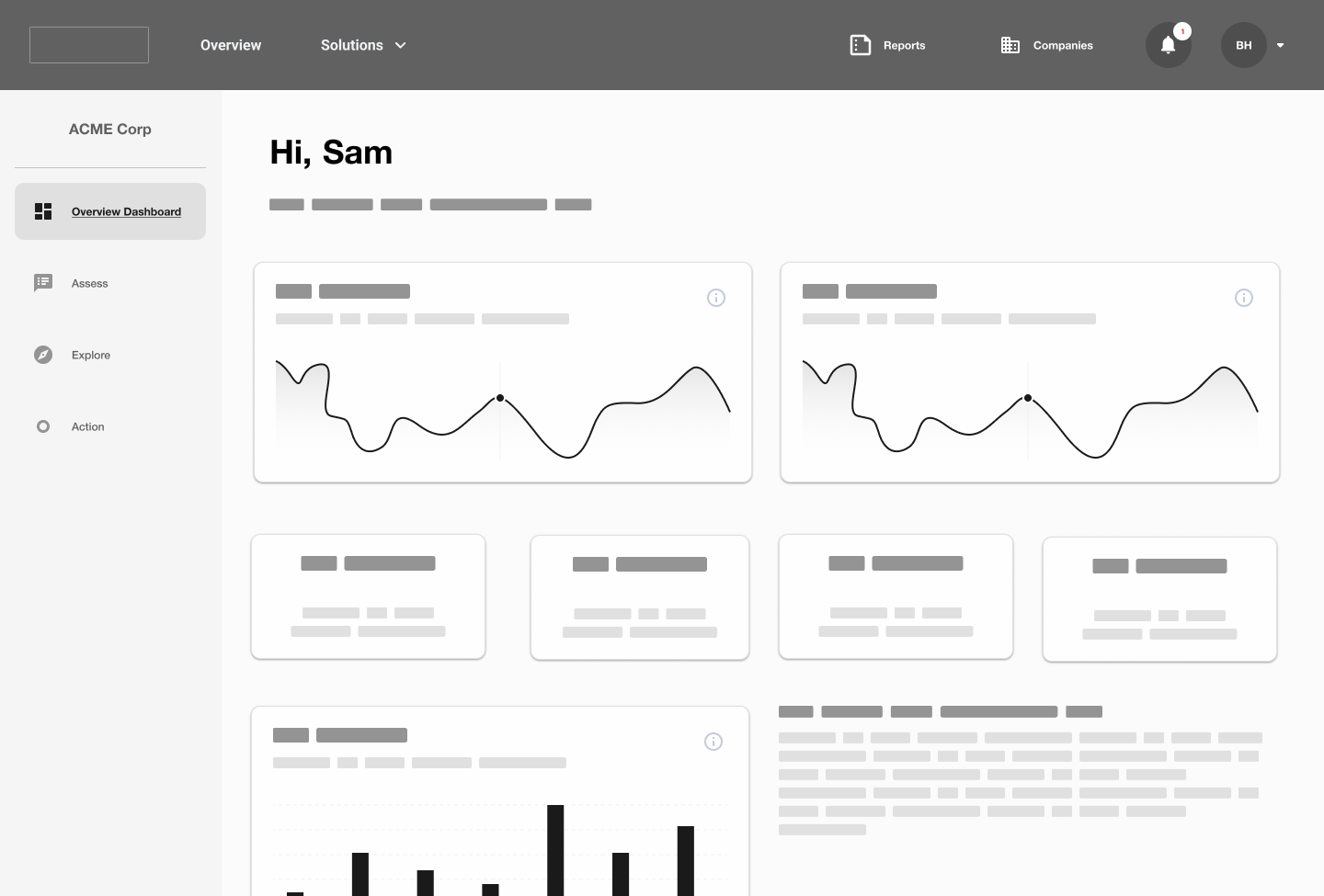
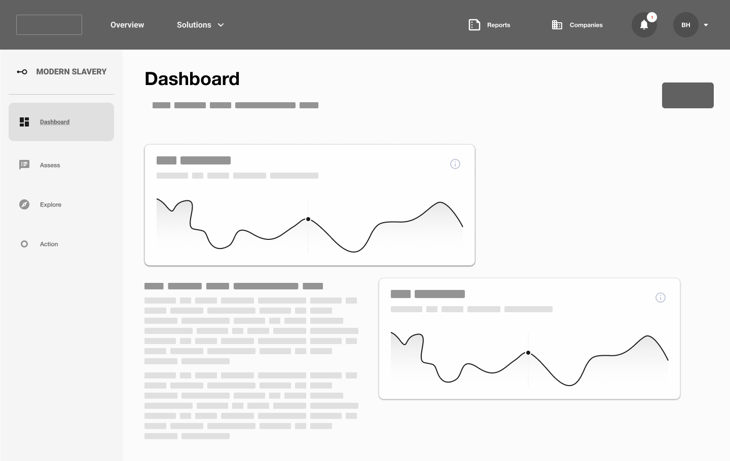
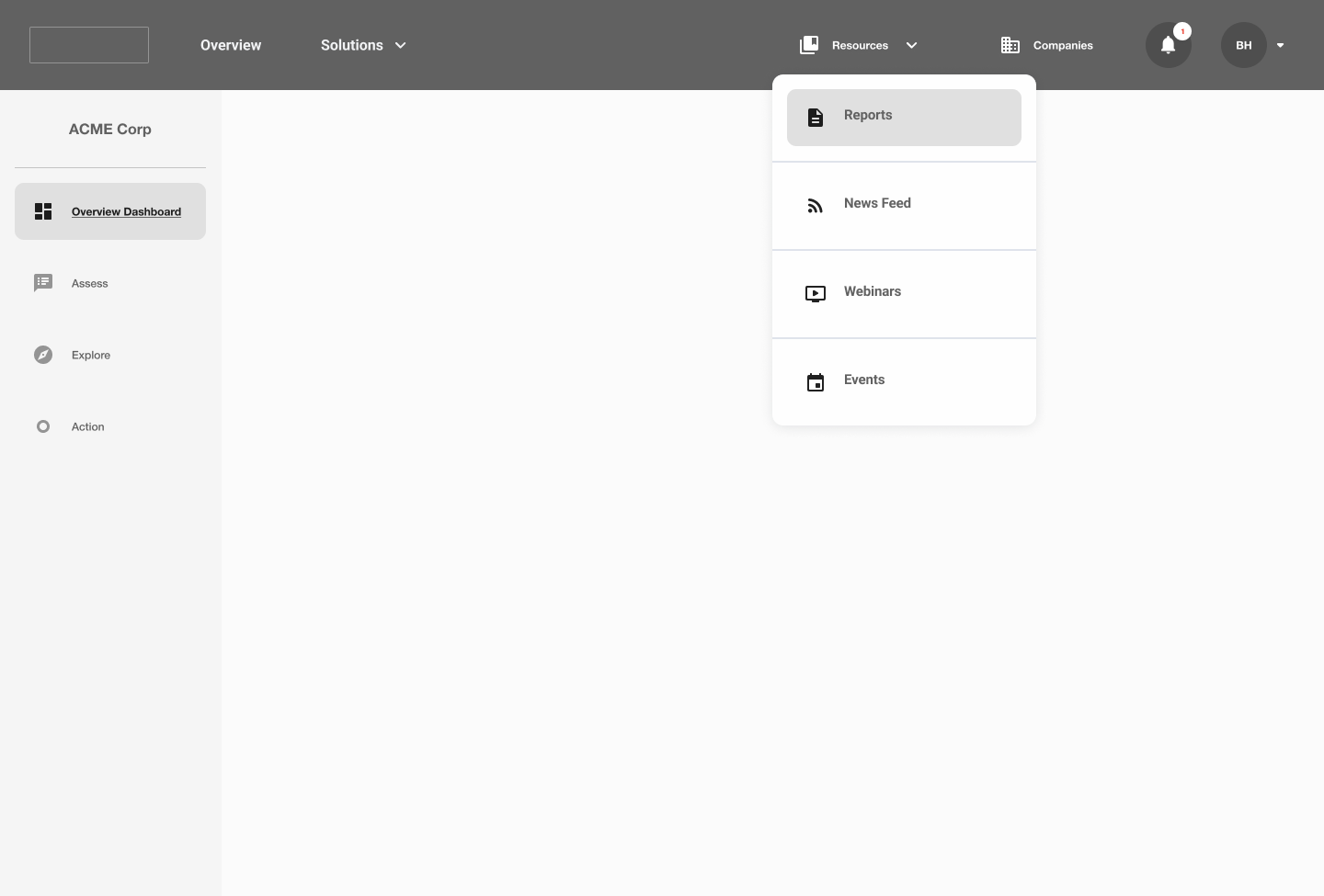
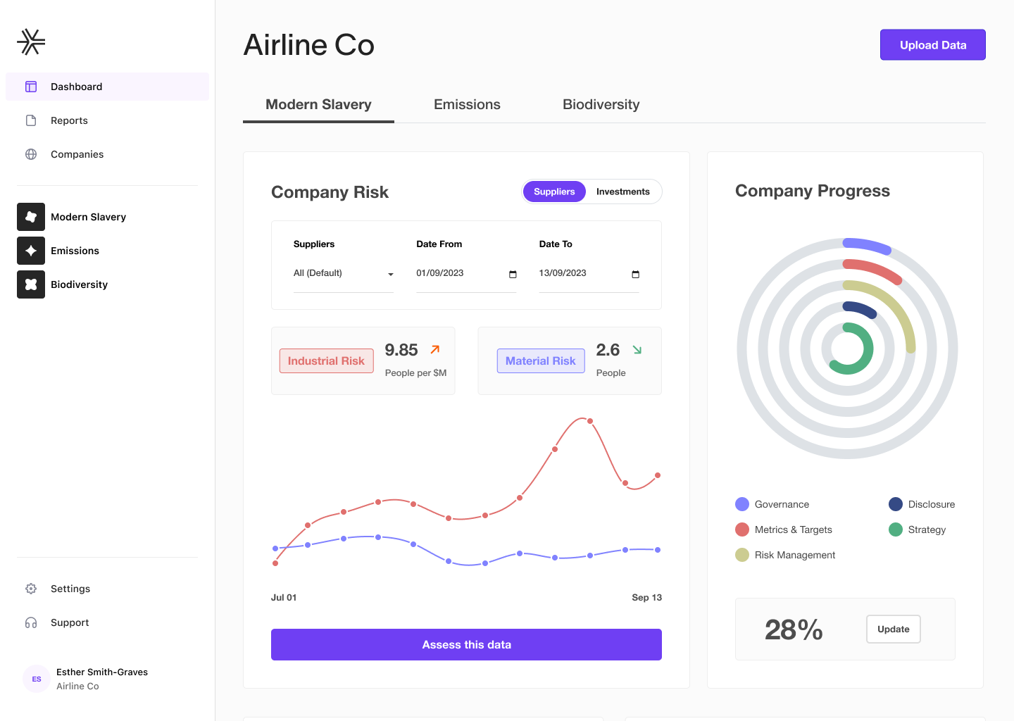
The old navigation used a flat top bar with tabs for Modern Slavery, Emissions, and Biodiversity — plus a secondary sidebar with Dashboard, Assess, Explore, and Action. Users couldn't tell where they were, or how the modules related to each other.
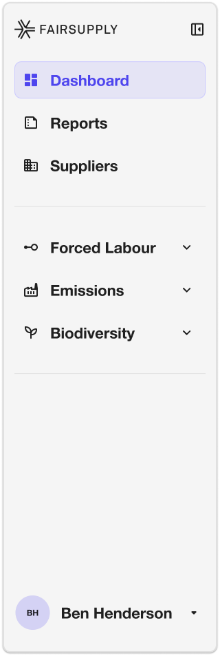
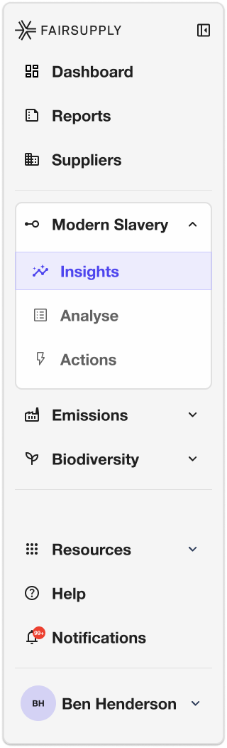
The redesigned navigation inverted this: a persistent sidebar organized by risk module (Forced Labour, Emissions, Biodiversity), each with three consistent sub-pages — Insights, Analyse, Actions. This mirrors how risk professionals actually think: "I'm in Forced Labour, looking at Insights." Not "I'm in Assess, filtered to Modern Slavery."
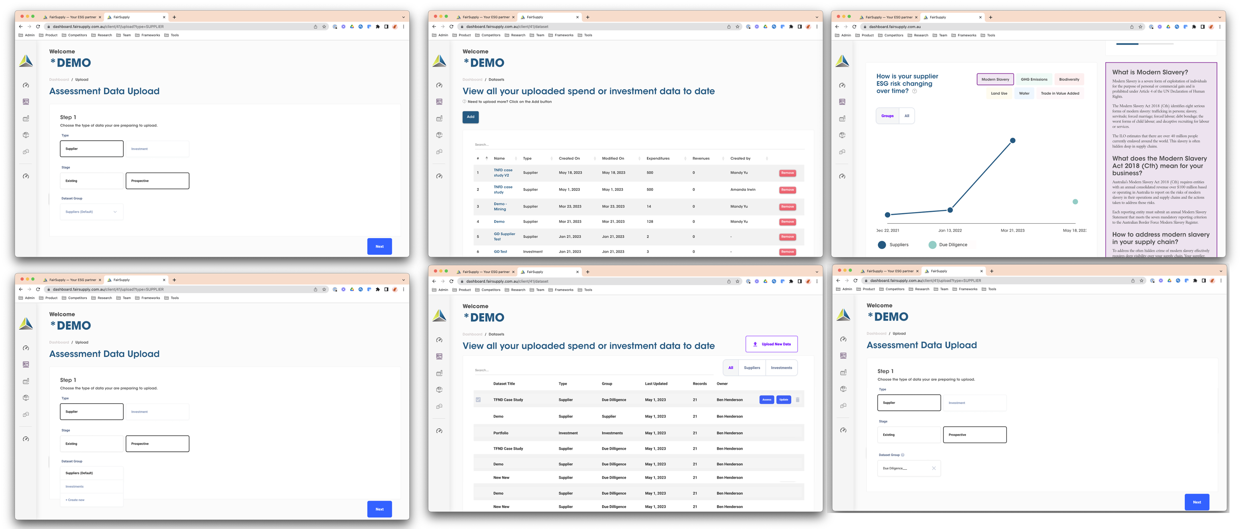
Sidebar iterations
The sidebar went through multiple iterations — from full labels with expanded dropdowns, to icon-only rails with fly-outs, to hybrid approaches. Each iteration was tested against the same question: can a new user find where they need to go without explanation?
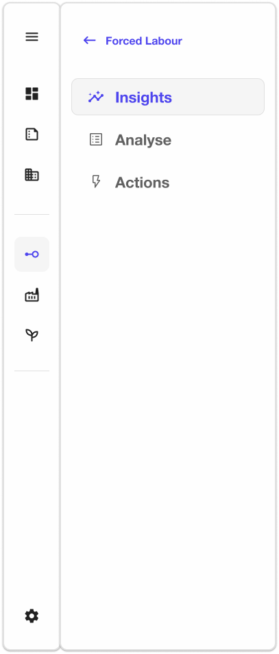
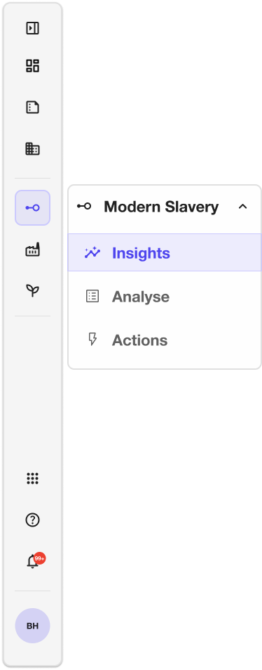
The final navigation architecture — icon rail with contextual fly-out — reduced the cognitive load of switching between risk modules while keeping the full sub-page structure discoverable and consistent.
Black, white, and
exactly one purple.
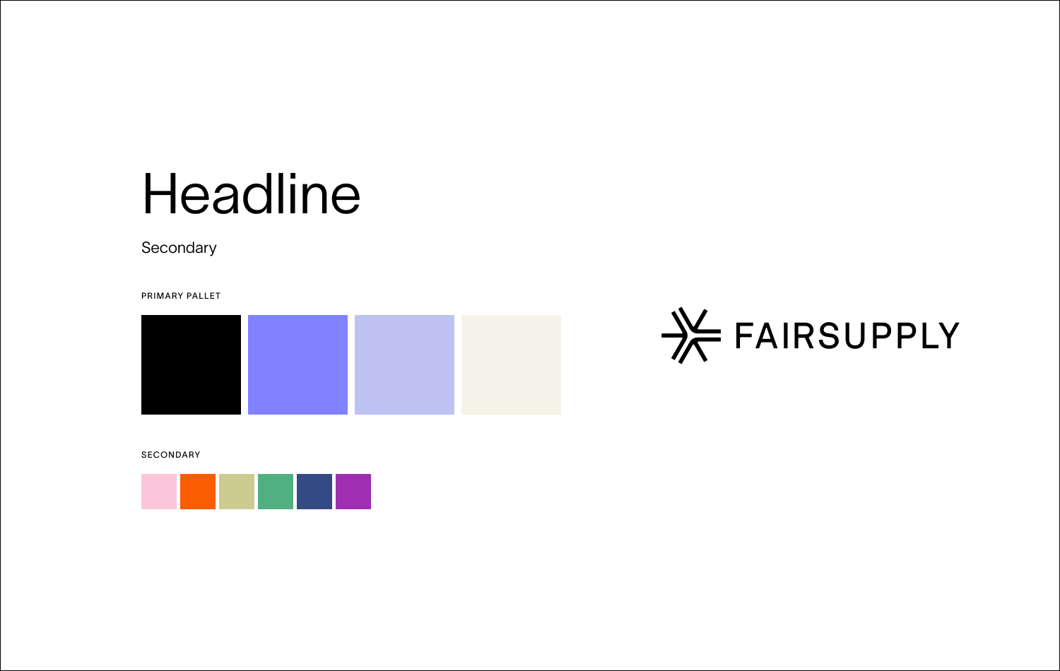
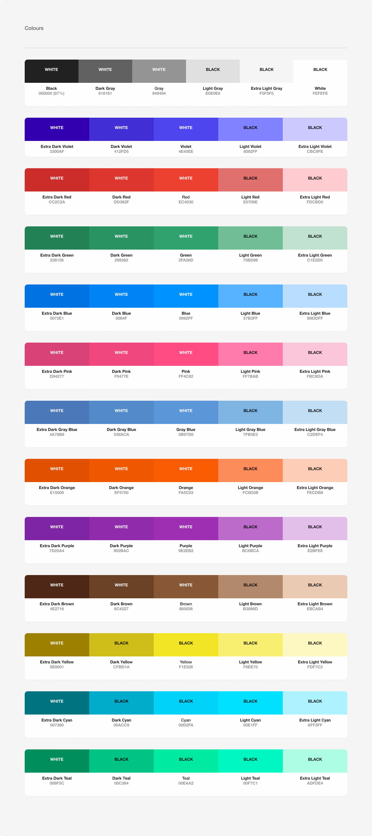
The rebrand from For Good Design Lab gave us a strong foundation: a near-monochrome palette of black, white, and off-white cream, with purple (#6366F1 / #4F46E5) as the sole accent. Translating that restraint into a data-heavy B2B product wasn't trivial.
The old product used purple everywhere — as a category fill, card accent, and button background simultaneously. The redesign reduced purple to its essential roles: active navigation state, primary CTAs, and brand accent moments. The UI itself became neutral, which meant color elsewhere — in risk chips, trend indicators, category charts — could finally breathe and communicate.
Brand → Product
The first look tests applied the brand palette directly to wireframed screens. Three rounds of iteration to find the right balance between brand presence and data legibility.
The system that made
scale possible.
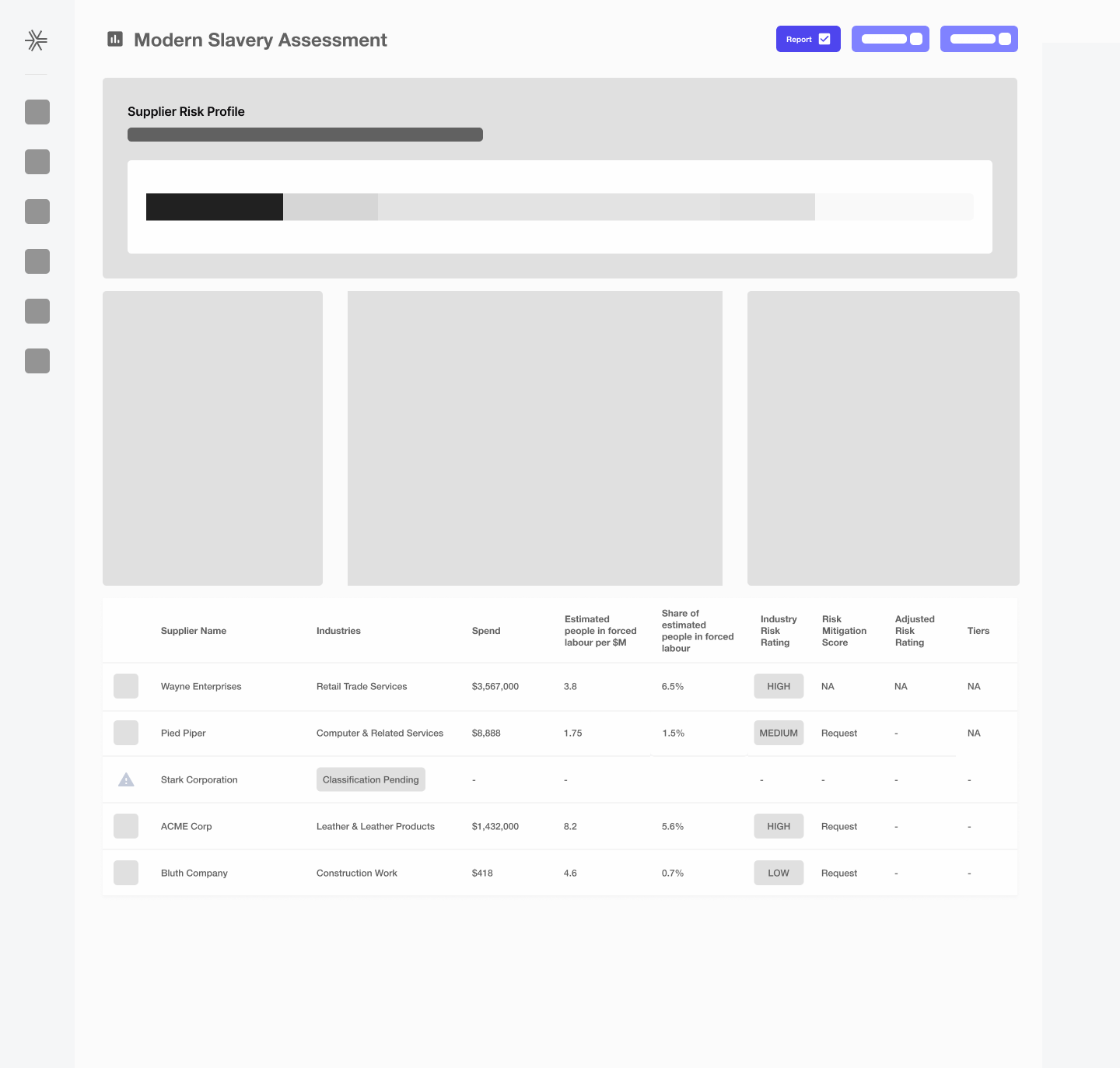
A platform that handles billions of data points — supplier tables with 50+ columns, risk distribution bars with 6 segments, KPI cards in 4-column grids — cannot be designed screen by screen. It needs a system. I built one from the ground up: tokens, components, spacing rules, and documented data visualization patterns that the engineering team could implement consistently at any scale.
"Prioritizing data over aesthetics meant finding creative ways to bring personality into the UI. The constraint — near-monochrome, no decorative color — pushed us into some of the most considered design decisions I've made."
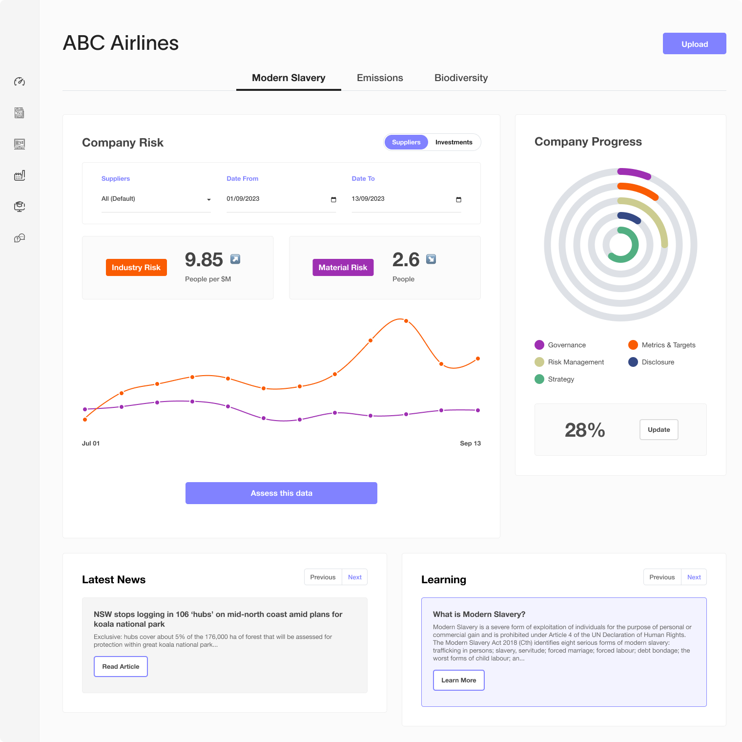
The full color system — brand, surface, border, text, and the 6-step risk spectrum from critical red to low green — all documented as design tokens and mapped to TypeScript constants for the engineering team.
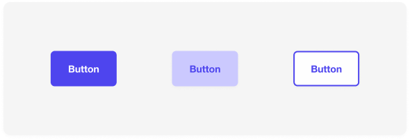
Every interactive element — buttons, risk chips, table rows, KPI cards, filter pills, sub-tab groups, recommendation cards — documented with variants, states, and implementation specs. The button system alone covers primary, secondary, and ghost variants with full interaction states.
Typography scale
Risk spectrum
In production.
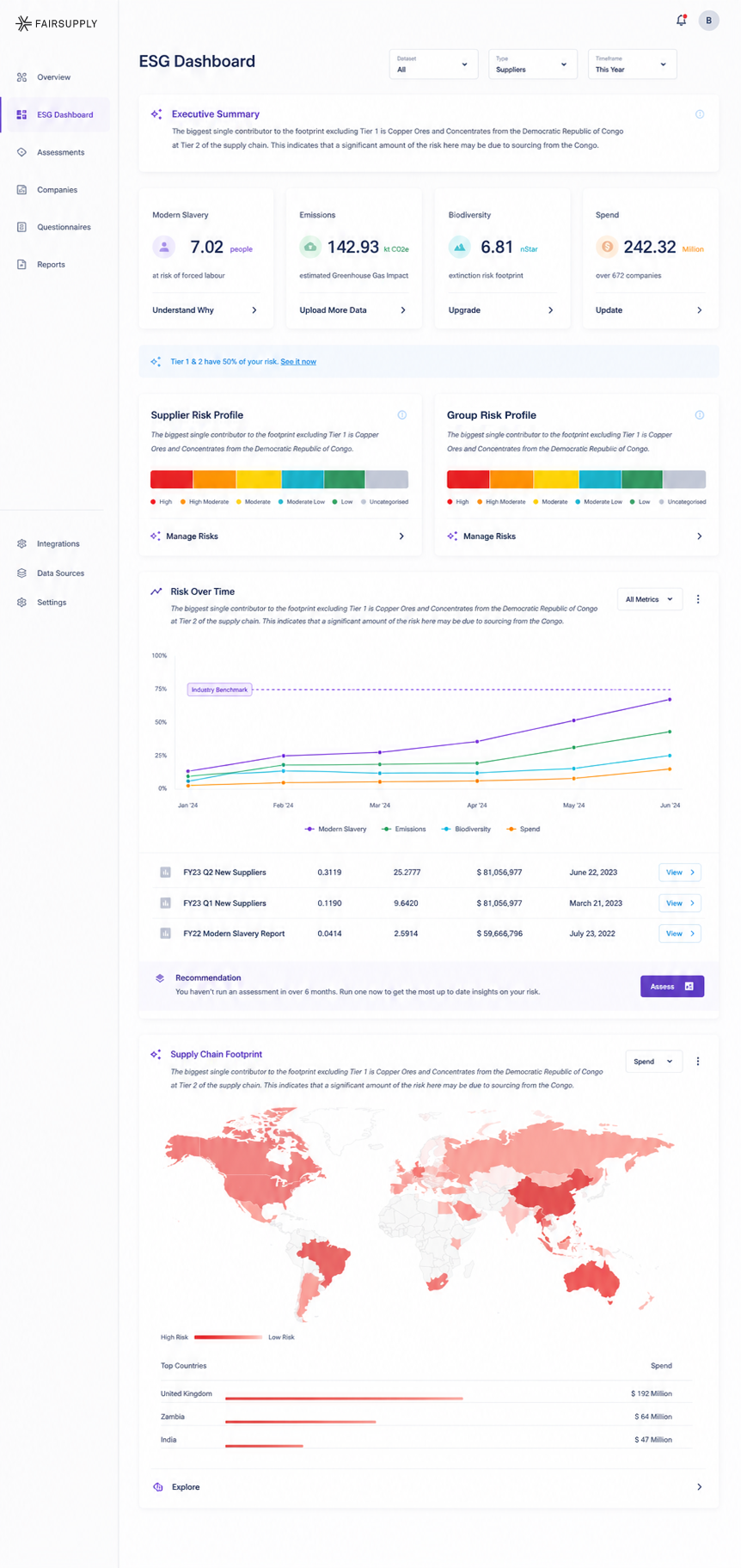
Three key screens that show the design system in action across different contexts — from the executive summary ESG Dashboard to the deep-dive Insights page to the granular Forced Labour assessment view.
Ask anything.
One of the more ambitious features we designed was an AI assistant embedded directly in the product. Rather than requiring users to navigate to a separate help section or bring in a consultant, the assistant could answer ESG questions in context — surfacing relevant legislation, explaining risk calculations, or clarifying what a score actually means — all powered by the platform's own proprietary data.
Designing this meant solving for trust as much as functionality. ESG data is high-stakes — answers carry regulatory and reputational weight. We built in an explicit AI disclaimer on every response, kept the interface calm and factual rather than conversational, and pre-loaded the assistant with the most common questions users already had, based on support ticket analysis.
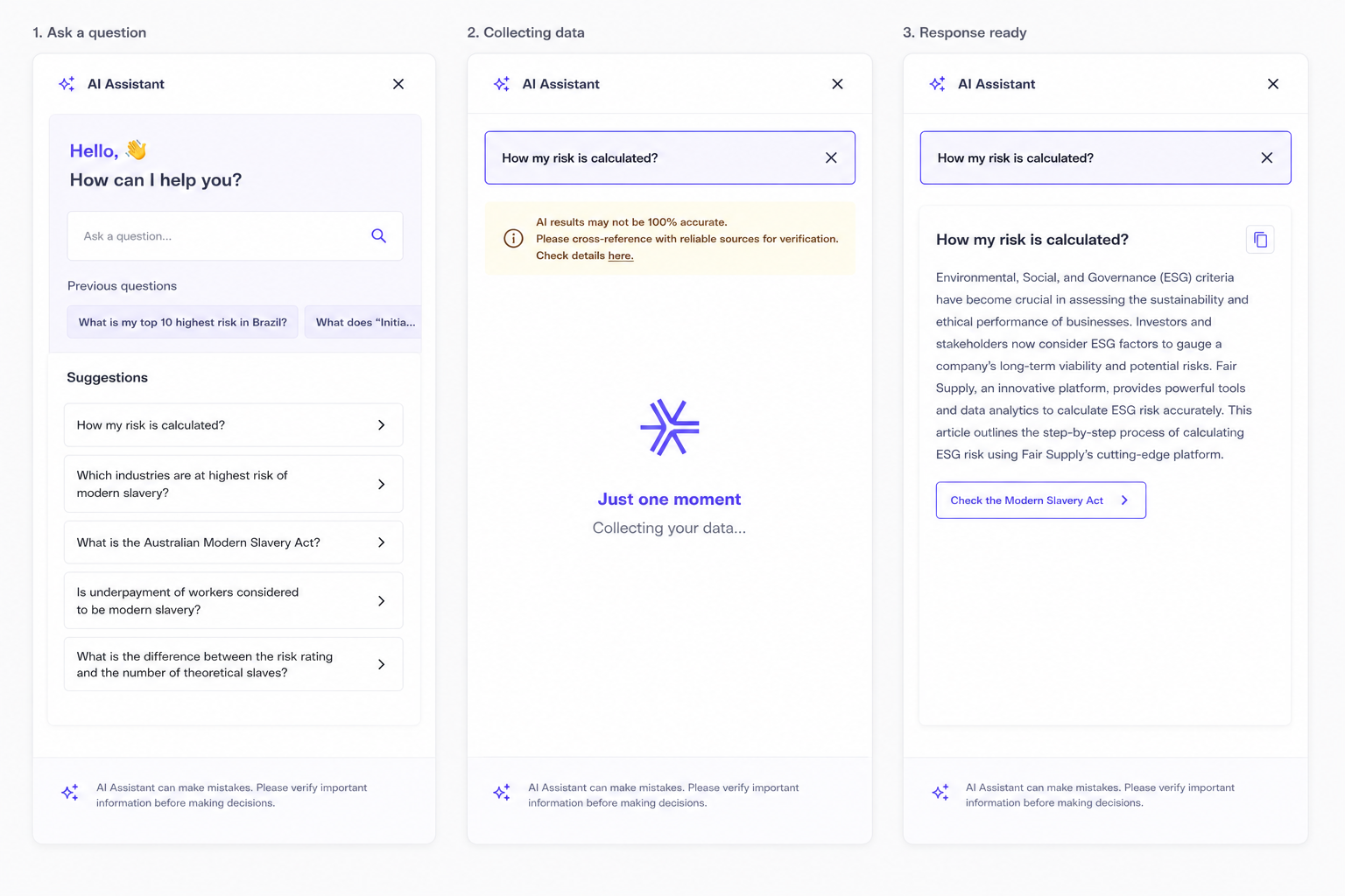
The assistant's tone was deliberately calm and informational. ESG questions can be anxiety-inducing — particularly around forced labour exposure. The interface needed to feel like talking to a knowledgeable colleague, not a chatbot.
A platform that earns trust
by being honest.
Specific customer and revenue figures are NDA-protected, but the directional signals are meaningful. Customer growth increased substantially and product adoption grew significantly across the engagement period. The most telling metric was engagement frequency — a shift that reflects what a well-designed product can do in a category where users previously had no intuitive alternatives.
compliance cycles only
not periodic audits
What this reinforced.
Being the first designer in a company at this stage meant the work was never purely execution. Every decision — whether to run a test, push back on scope, slow down to document a pattern — required judgment about what would actually matter for the product's future. That's a different kind of influence than having a seat at the table. It's building the table while everyone's already sitting at it.
Working alongside environmental PhDs, legal experts, and economists reshaped how I approach domain-heavy products. Deep collaboration with subject-matter experts doesn't just improve accuracy — it changes how you understand what's actually worth designing. I learned as much about ESG as I did about design during this engagement.
FairSupply reinforced something I believe about complex products: the hardest challenges aren't about simplification — they're about making complexity navigable. The platform's power was inseparable from its depth. The job wasn't to sand it down. It was to build the right structure so users could reach whatever level of detail they actually needed.
In compliance and regulatory contexts, how you present data is the product. Getting it wrong isn't just a design problem — it's a business problem, a legal problem, and an ethical one. That weight made the work more demanding, and more meaningful, than most.